Why are some logos instantly recognizable and powerful? Famous logos achieve this through simplicity, clear messaging, and strong brand identities. A logo communicates a brand’s message and helps shape the brand image in the minds of consumers. A logo also serves as a visual representation of a brand’s identity, encapsulating its core values and personality.
Companies sometimes face pivotal moments when they decide to rebrand or redesign their logos, which can significantly impact their overall branding. For example, in 2012, Airbnb underwent a major rebranding with the introduction of its Bélo logo, symbolizing belonging and community. This redesign marked a strategic shift to position Airbnb not just as a lodging platform but as a global community-driven brand. The new logo helped Airbnb strengthen its brand identity and connect emotionally with users worldwide, showcasing how a well-timed logo redesign can play a crucial role in a company’s growth and market presence.
In this article, we explore 75 logos of renowned brands that have stood the test of time and delve into what makes them iconic. Discover how elements like color, typography, and symbolism contribute to their lasting impact.
Key Takeaways
- Iconic logos forge emotional connections, enhance brand recall, and must be simple yet versatile to stand the test of time.
- Logos like Apple, Nike, and Coca-Cola demonstrate how design evolution aligns with brand identity and values, often encapsulating complex narratives in simple shapes.
- The most memorable logos and most recognizable logos foster trust and emotional connection through timeless design elements, such as distinctive colors and script styles, making them instantly identifiable and culturally significant.
- Modern branding incorporates dynamic elements, such as animated logos, to enhance engagement and relevance in the digital landscape.
1. Apple Logo: Simple and Memorable
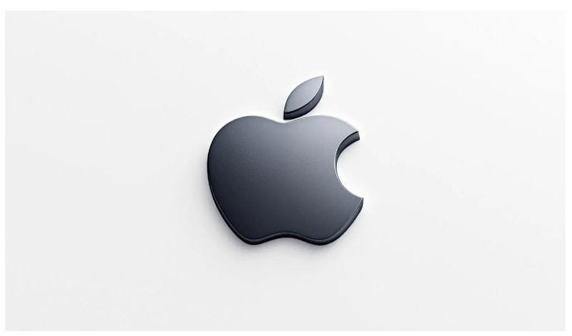
It is also a perfect example of how a design can evolve to reflect a brand’s changing identity and values. Initially, the logo was an intricate design featuring Isaac Newton under an apple tree, symbolizing discovery and innovation. Under Steve Jobs’ leadership, Apple shifted to a monochrome logo, embracing a minimalist aesthetic that emphasized simplicity and clarity. This change marked the beginning of Apple’s journey towards becoming a design icon, with the bitten apple silhouette becoming one of the most recognizable symbols in the world.
The Apple logo is one of the best examples of how a company’s vision can be reflected in a simple, memorable design. The simplicity of the logo allows it to be versatile and adaptable across various products and mediums, maintaining its effectiveness and recognizability. The logo’s evolution reflects Apple’s commitment to innovation and quality, consistently aligning with the brand’s core values.
From the rainbow-colored version symbolizing creativity and inclusivity to the current sleek, monochrome design, the Apple logo has successfully encapsulated the brand’s essence and established a strong visual identity.
2. Nike Logo Swoosh: A Symbol of Victory
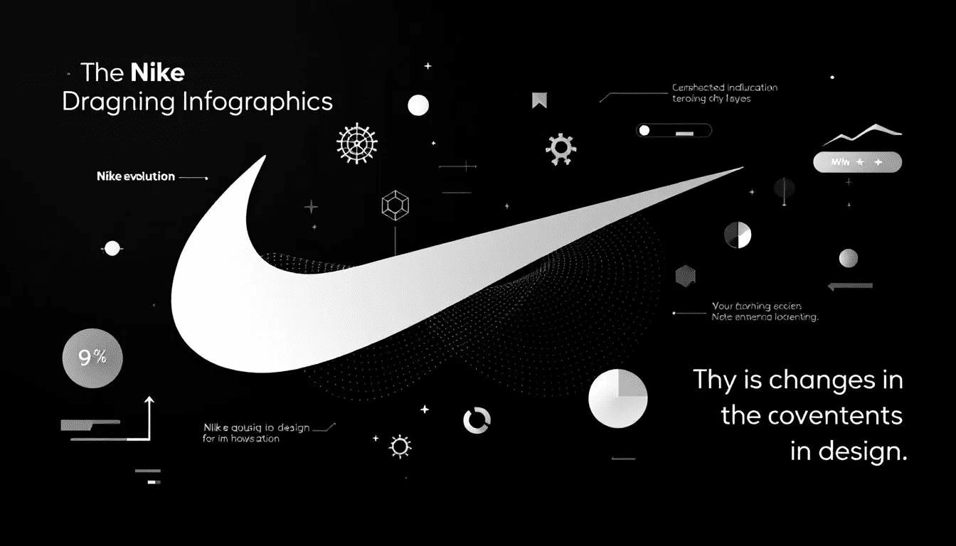
The Nike Swoosh, designed in 1971 by graphic design student Carolyn Davidson, is a masterclass in simplicity and symbolism. Initially, the logo was met with mixed reactions, with Nike co-founder Phil Knight famously admitting he wasn’t initially impressed. However, the Swoosh quickly grew to symbolize the brand’s core values of speed, power, and athleticism, embodying the wing of Nike, the Greek goddess of victory. Over time, the Swoosh has come to represent not just a brand, but a culture of athleticism and a spirit of determination, making it one of the most powerful logos in the world. This powerful symbolism has made the Swoosh an enduring emblem of triumph and excellence in sports.
One of the most remarkable aspects of the Nike logo is its evolution from being paired with the word ‘Nike’ to becoming a standalone symbol recognized worldwide. This transition underscores the logo’s strength and the brand’s confidence in its iconic status.
3. Coca-Cola Logo: Timeless Brand Identity
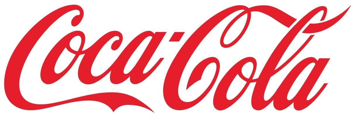
The Coca-Cola logo is a prime example of a brand identity that has stood the test of time. Designed in the late 19th century, the logo’s unique script font and intricate linework set it apart from other brand logos, creating a sense of personal and inviting charm. The script font, combined with the striking red color, evokes feelings of excitement and energy, making the logo highly recognizable and visually impactful. Remarkably, the Coca-Cola logo has remained largely unchanged for over a century, reflecting the brand’s rich history and tradition and placing it among the most famous logos and the famous logo.
Beyond its visual appeal, the Coca-Cola logo is deeply linked with emotions of joy, nostalgia, and celebration. This emotional connection has helped Coca-Cola maintain a strong bond with its consumers, making the logo more than just a brand symbol but a representation of happy moments and shared experiences.
The Coca-Cola logo’s timeless design continues to capture the essence of the brand and its global phenomenon status.
4. Google Logo: Colorful Evolution
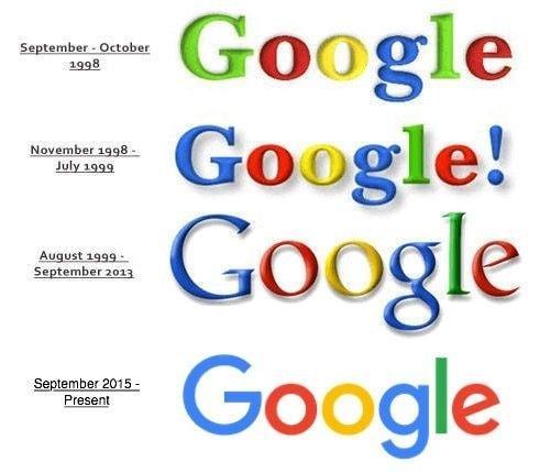
The Google logo, with its colorful and approachable design, perfectly represents the company’s innovative spirit and user-friendly ethos. The simple, text-based logo uses a varied color palette to draw attention and convey vibrance. The logo’s design features:
- A primary color palette of blue, red, yellow, and green, reflecting the brand’s playful and inclusive nature.
- A multicolor approach that makes the logo visually appealing.
- Symbolism of Google’s diversity and openness to different ideas and cultures.
Over the years, the Google logo has undergone several redesigns, each iteration refining its appearance while maintaining its core elements. The current sans-serif, multicolor font is simple yet distinctive, ensuring the logo remains easily recognizable across digital and physical platforms. This evolution highlights Google’s commitment to staying relevant and accessible, solidifying its status as one of the most famous and beloved brand logos in the world.
5. Starbucks Mermaid: A Global Coffee Icon
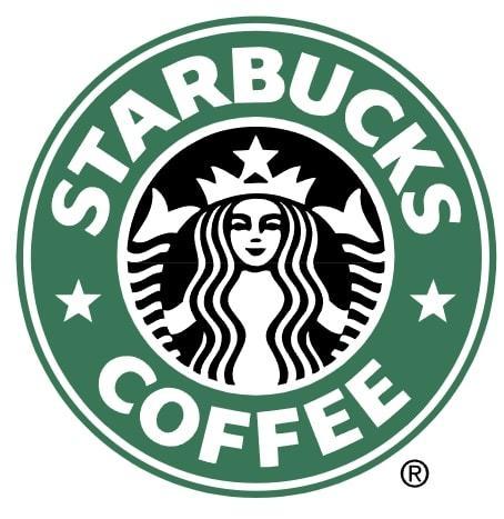
The Starbucks logo, featuring the iconic siren, is a symbol of coffee, community, and connection. The siren reflects a theme of mythology and premium quality, connecting to the brand’s maritime roots. This unique design element sets the Starbucks logo apart from conventional brand logos, creating a sense of intrigue and allure. The siren also ties the brand to maritime culture and the history of the coffee trade, enhancing the logo’s narrative and making it more relatable to consumers.
The circular frame of the Starbucks logo symbolizes cohesion and unity, reinforcing the brand’s identity across packaging and signage. The logo’s evolution from its original 1971 design to its current form has enhanced its brand identity, making it a globally recognized symbol of shared moments and social connections over a cup of coffee.
6. Amazon’s Hidden Message
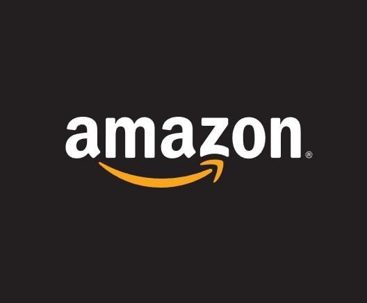
The Amazon logo is a masterclass in subtlety and clever design. Its most distinctive feature is the arrow that extends from the letter ‘A’ to ‘Z,’ symbolizing the company’s wide product range and commitment to customer satisfaction. This arrow also implies delivery, reinforcing the brand’s promise of efficiency and reliability. The arrow pointing from ‘A’ to ‘Z’ further emphasizes Amazon’s dedication to offering everything under the sun, making it a powerful and memorable brand symbol.
The minimalist style of the Amazon logo contributes to its recognition and iconic status. The arrow also doubles as a smile, representing the happiness and satisfaction customers feel when shopping with Amazon. This emotional impact, combined with the logo’s simplicity, has made the Amazon logo one of the most effective and beloved brand logos in the world.
7. McDonald’s Golden Arches
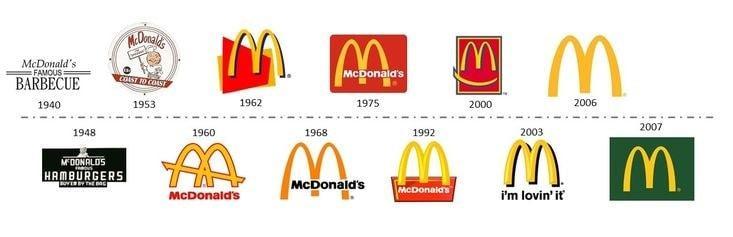
The McDonald’s Golden Arches are among the most recognizable symbols in the world. Originally designed in 1962, the arches were inspired by the need for greater visibility and an eye-catching design that would stand out. The bright yellow ‘M’ shape not only catches the eye but also evokes feelings of warmth and happiness, contributing to the logo’s iconic status. However, only a few people pay attention to the subtle design details of the McDonald’s logo, despite its global recognition.
The Golden Arches were initially part of the restaurant’s architecture before evolving into the brand’s logo. The combination of yellow and red colors in the logo conveys flavor and passion, making it an effective symbol for a fast-food chain. The McDonald’s logo has become synonymous with convenience, flavor, and the joy of sharing a meal, making it one of the most enduring brand logos in the world.
8. FedEx Logo and Its Clever Use of Negative Space
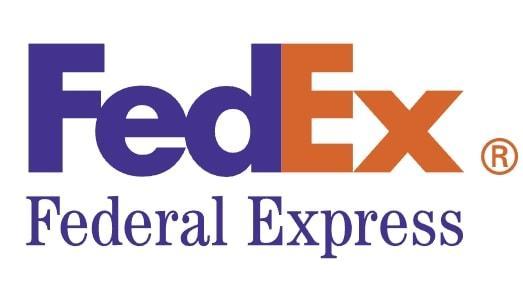
The FedEx logo is a brilliant example of clever design and effective use of negative space. Designed by Lindon Leader in 1994, the logo features a hidden arrow between the ‘E’ and the ‘x,’ symbolizing speed and efficiency. The parallelogram in the logo cleverly hides the arrow, further emphasizing precision in delivery. This subtle yet powerful design element enhances the brand’s image and memorability, making the FedEx logo a standout example of innovative logo design.
The implicit nature of the arrow allows it to contribute to the brand’s image without overwhelming the overall design. The FedEx logo demonstrates how thoughtful design can enhance brand perception, making it one of the most memorable and iconic logos in the world.
9. Mastercard Logo: Symbol of Trust
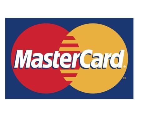
The Mastercard logo, with its simple and bold design, is easily recognizable and symbolizes trust and cooperation. The logo features two overlapping circles, one red and one yellow, with the overlap forming an orange hue. The yellow circle is a key visual element that symbolizes prosperity and connection. The overlapping circles of the Mastercard logo symbolize the connection between consumers and financial transactions. This design represents the unity and connection between consumers and merchants, reinforcing the brand’s identity as a trusted facilitator of transactions.
The bright colors used in the Mastercard logo are not only visually impactful but also symbolize prosperity and cooperation. The current iteration of the Mastercard logo, introduced in 2019, is designed to work efficiently across both digital and physical platforms, ensuring its relevance in an increasingly digital world. The circular design of the logo resembles a smile, indicating happiness and positivity associated with the brand.
10. Disney Logo: A Signature of Magic
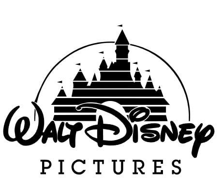
The Disney logo is a signature of magic and wonder, perfectly encapsulating the essence of the brand. Modeled after Walt Disney’s signature, the font adds a personal touch and a sense of authenticity to the brand’s identity. The stylized signature reinforces the brand’s personal touch and creative spirit, strengthening its cultural connection and brand identity. The childlike appearance of the crayon-typeface conveys playfulness and creativity, making the logo appealing to both children and adults.
A shooting star and Cinderella’s castle are also part of the logo’s design, symbolizing dreams and fantasy. These elements, combined with the colors blue, white, and yellow, contribute to the logo’s magical representation, making it one of the most beloved and recognizable brand logos in the world.
11. BMW Logo: Emblem of German Engineering
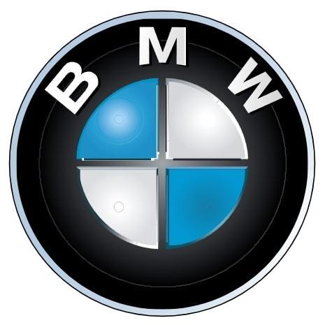
The BMW logo is an emblem of German engineering excellence and tradition. First registered in the German Imperial Register of Trademarks in October 1917, the logo initially featured a black ring with the company’s name. Over time, it evolved to include the blue and white quadrants representing the Bavarian colors, reflecting the brand’s heritage and origin. As a leading car company, BMW’s logo symbolizes its engineering heritage and innovation. The use of geometric shapes in the BMW logo conveys a message of reliability and efficiency, further emphasizing the brand’s German heritage.
The design of the BMW logo has adapted to reflect the brand’s transition towards future mobility, maintaining its core elements while embracing modern aesthetics. The logo’s colors and design symbolize the brand’s commitment to quality, innovation, and engineering excellence, making it one of the most iconic logos in the automotive industry.
12. Target Bullseye: Simple Yet Effective
The Target logo, with its bold and minimalist design, is a perfect example of simplicity and effectiveness. The vivid red bullseye is instantly recognizable and symbolizes the brand’s name and identity. The strong contrast between the red and white colors enhances the logo’s visibility and memorability, making it easy for consumers to recall the best logo. The bullseye also symbolizes precision, serving as a clear visual identifier for the retail brand and reinforcing its focus on accuracy and customer satisfaction.
Symbols like the Target logo are easier to remember than text, enhancing brand recognition and customer loyalty. The simplicity of the logo captures a modern, clean, and exciting persona, perfectly aligning with the brand’s identity and company’s mission.
13. IBM Logo: Leader in Technology
The IBM logo represents a progressive image that aligns with the brand’s leadership in technology. The parallel lines in the logo symbolize speed and efficiency, emphasizing the brand’s technological prowess and innovative qualities. These horizontal lines reflect the company’s focus on technology and performance, further reinforcing its reputation as a leader in the tech industry. This structured typography and clean lines contribute to the logo’s consistent and professional appearance.
Overall, the design and symbolism of the IBM logo reinforce its reputation as a leader in the technology sector. The logo’s ability to convey a sense of innovation and reliability has made it one of the most iconic and respected brand logos in the world.
14. Mercedes-Benz Star: Luxury and Heritage

The Mercedes-Benz logo, featuring a three-pointed star, symbolizes the brand’s dominance over land, sea, and air. Each point of the star represents one of these elements, highlighting the brand’s comprehensive engineering capabilities. The silver color of the logo denotes luxury and sophistication, reinforcing the brand’s image as a premium car manufacturer with a rich heritage. Originally, the logo also featured a laurel wreath encasing the star, further emphasizing the brand’s legacy and prestige.
15. Shell Logo: From Classic to Contemporary
The Shell logo has undergone significant evolution since its inception in 1900. Inspired by a seashell found on a beach in the Philippines, the original logo was a simple black and white mussel shell depiction. In 1948, the logo introduced its signature colors, red and yellow, marking a significant design shift that enhanced its visibility and recognizability. The shell logo of Shell uses vibrant colors to create a bold and easily recognizable brand icon in the energy sector.
The modern Shell logo features a simplified scallop shape on a white background, reflecting the company’s growth and adaptation to modern branding strategies. This evolution from a realistic 3D depiction to a flat, two-dimensional shape demonstrates Shell’s commitment to maintaining a strong and adaptable brand identity.
16. Unilever “U” and Its Symbols
The Unilever logo is a masterful representation of the brand’s mission to craft a better and more sustainable future. The ‘U’ in the logo is composed of 25 different objects, each symbolizing the various products sold by Unilever. These objects, which include a bee, a spoon, and a strand of hair, add depth and creativity to the logo, making it visually engaging and meaningful.
The boundary of the ‘U’ allows for creative expression while maintaining clean lines and structure. This innovative design not only represents Unilever’s diverse product range but also communicates the brand’s commitment to sustainability and quality, making it a standout example of effective logo design.
17. Pepsi Globe: American Identity
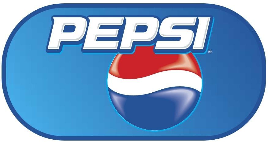
The Pepsi logo symbolizes:
- Youth, vibrancy, and celebration through its circular shape and vibrant colors.
- A bottle cap design, enhancing its recognizability and connection to the beverage industry.
- American identity and positive emotions of happiness and joy through its prominent colors of blue, red, and white.
- The circular design also resembles a smile, indicating happiness and positivity associated with the brand.
The latest iteration of the Pepsi logo includes elements inspired by concepts such as the golden ratio and gravitation, adding a sense of harmony and balance to the design. This thoughtful approach to logo design ensures that it remains fresh and relevant while maintaining a strong connection to its brand identity.
18. Visa’s Blue and Gold Design
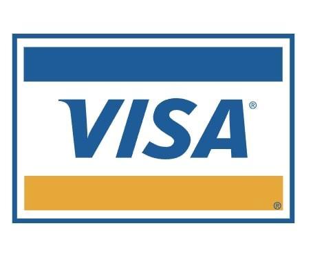
The Visa logo features:
- A dark gradient blue and gold design that conveys trust, professionalism, and reliability.
- Blue color, which is significant in financial transactions as it enhances consumer trust and confidence.
- A winged ‘V’ symbolizing motion and speed, reflecting the seamless and efficient nature of Visa’s services.
This combination of colors and design elements makes the Visa logo a powerful symbol of financial stability and security. The logo’s ability to convey these qualities has made it one of the most trusted and recognizable brand logos in the financial industry.
19. National Geographic Yellow Frame
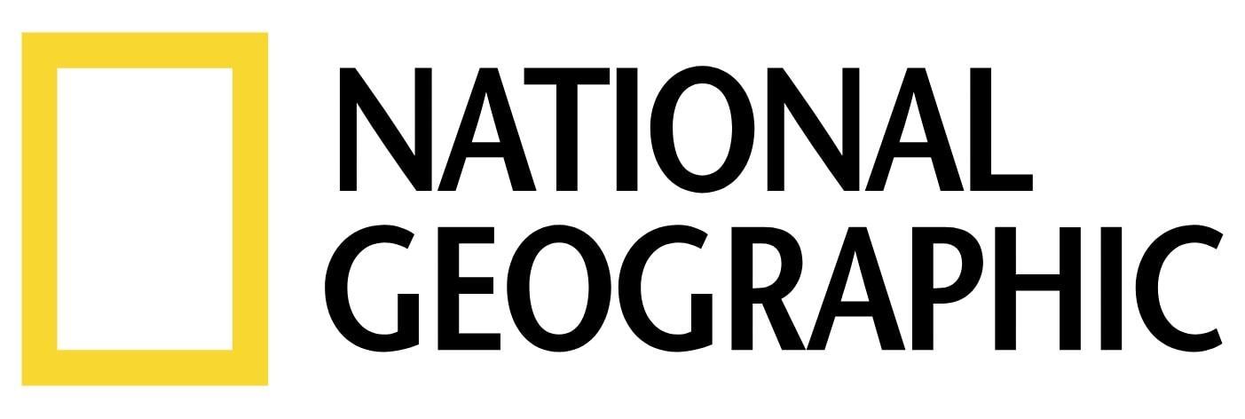
The National Geographic logo, featuring a bright yellow rectangle, is inspired by the magazine’s cover and serves as a strong brand identifier. This yellow frame symbolizes the magazine’s commitment to stunning photography and rich content related to geography and culture. The modern, sans-serif typeface reflects the brand’s shift to digital media, enhancing its recognition in contemporary contexts.
Guidelines for the logo’s usage ensure consistency across different National Geographic units globally, reinforcing its brand identity and making it one of the most iconic logos in the world. The yellow frame has become synonymous with exploration, discovery, and knowledge, capturing the essence of the National Geographic brand.
20. Audi Rings: Unity and Innovation
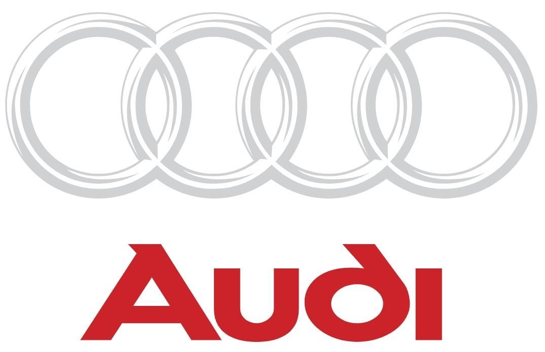
The Audi logo, featuring four interlocking rings, represents the union of four manufacturing companies, symbolizing unity and collaboration. This design has become a symbol of Audi’s commitment to excellence and innovation within the automotive industry. The simplicity and elegance of the rings make the logo visually appealing and memorable.
The Audi logo connotes technological supremacy, attention to detail, and beauty, reflecting the brand’s focus on innovation and quality. This powerful combination of design and symbolism has made the Audi logo one of the most respected and recognizable logos in the automotive sector.
21. Rolex Crown: Symbol of Prestige
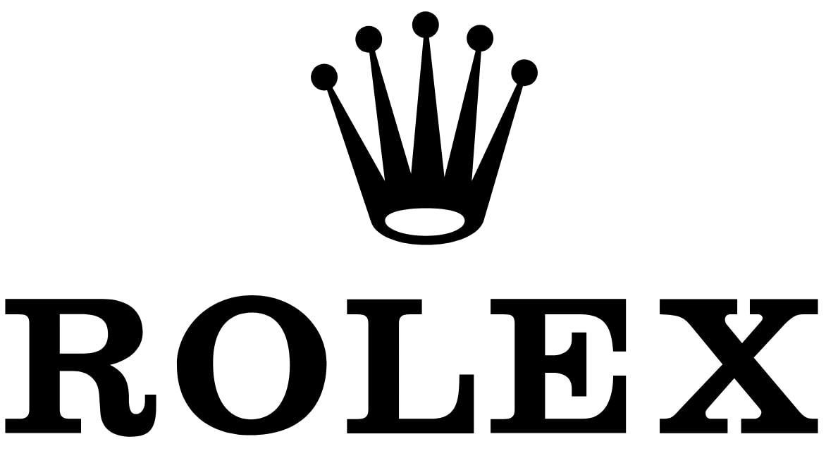
The Rolex logo, featuring a crown, is a symbol of prestige and excellence. The crown hints at the brand’s reputation as an old and respected business known for its trust and precision. The black and white colors in the logo symbolize luxury, prestige, and timelessness in the luxury watch market. This consistent element in the logo emphasizes Rolex’s commitment to quality and craftsmanship.
The colors gold and green in the Rolex logo convey a strong sense of luxury and growth, reflecting the brand’s heritage and success. The logo not only serves as a symbol but also embodies the values and history of the brand, making it an iconic emblem in the luxury market.
22. Dell’s Unique Slanted “E”
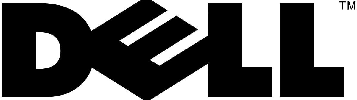
The Dell logo features:
- The company name in clean lines encased in a circle
- A unique slanted ‘E’ that adds visual intrigue and aids memorability, making the logo stand out in a competitive market
- The primary color blue, which conveys trust and professionalism
After the merger in 2016, the Dell logo underwent changes, resulting in thinner letters while maintaining the same proportions. This evolution reflects Dell’s commitment to innovation and adaptability, ensuring the logo remains relevant and recognizable.
23. Verizon’s Minimalist Transformation
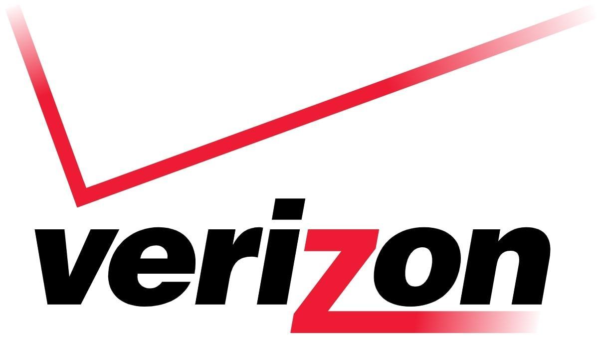
The Verizon logo represents reliability and seamless connectivity. The new logo features:
- A red ‘Z’ designed to symbolize both truth and future possibilities
- A straightforward wordmark
- A sharp red checkmark These elements create a bold and engaging brand identity.
The bold black Helvetica typeface and red checkmark represent a commitment to excellence and innovation. This minimalist design enhances the visual impact of the logo, ensuring it remains scalable and effective across various platforms.
24. Nestlé Bird: Nurturing and Simplicity
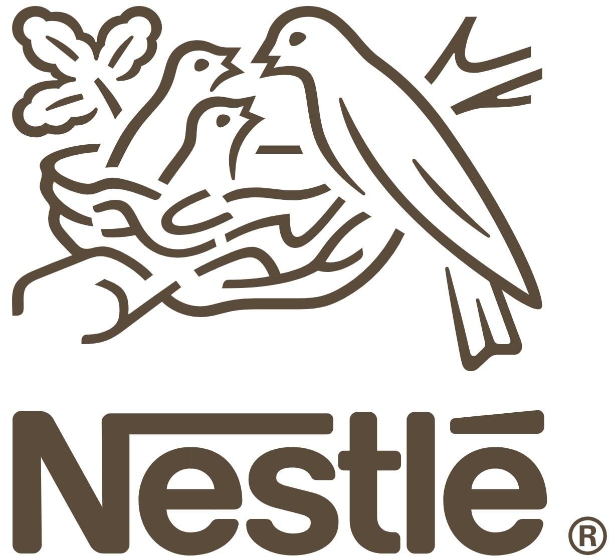
The Nestlé logo, featuring a bird feeding its young, symbolizes the brand’s commitment to nurturing and simplicity. This design choice evokes feelings of care, nourishment, and trust, aligning perfectly with Nestlé’s mission to provide quality and wholesome food. The balanced use of colors in the logo further enhances its nurturing message, making it visually appealing and memorable.
The bold typeface used in the Nestlé logo conveys reliability and strength, reinforcing the brand’s identity as a trusted provider of nourishment. The simplicity of the design ensures that the logo remains easily recognizable and effective across various products and platforms.
25. Instagram Camera Icon: Modern Connectivity

The Instagram logo has undergone significant changes since its inception, evolving from a retro Polaroid camera design to a modern, colorful gradient icon. This shift in 2016 aimed to modernize the brand’s image while maintaining its core element of a camera outline, symbolizing the act of capturing and sharing moments. The vibrant pink, purple, and yellow gradient reflects creativity and emotion, making the logo visually appealing and engaging.
The minimalistic design ensures that the Instagram logo remains recognizable on small screens and across app platforms, enhancing user experience and brand consistency. Despite initial mixed reactions, the new logo has become widely accepted and embraced by users, reinforcing Instagram’s position as a leading platform for modern connectivity.
26. Facebook “F”: Global Social Identity
The Facebook “F” logo is designed for clarity and recognition, even at small sizes. Originally chosen because of Mark Zuckerberg’s red-green color blindness, the blue color conveys trust, security, and professionalism, which are key attributes for a social media platform.
The lowercase letter “f” inside a blue square has become symbolic of modern social interaction, representing Facebook’s mission to connect people worldwide. Over the years, the logo has undergone several refinements while retaining its core design, ensuring it remains simple and appealing to a broad audience.
27. Twitter/X: Voice of the Digital Age
Twitter’s original bird logo, affectionately named “Larry,” symbolized freedom and real-time sharing, capturing the essence of the platform. However, in 2023, Elon Musk rebranded Twitter as “X,” introducing a monochrome, sharp-edged logo that drastically changed the platform’s identity. Critics noted that this sudden shift broke with years of recognizable branding, reflecting Musk’s influence and vision for the platform.
The new “X” logo is futuristic and aligns with Musk’s other ventures like SpaceX and X.com, emphasizing a bold new direction for the platform. While the transition was met with mixed reactions, it highlights the evolving nature of digital branding in the modern age.
28. YouTube Play Button: Visual Entertainment Powerhouse
YouTube’s logo features a red play button, symbolizing video content and instant playback. This simple yet powerful design element was added in 2011 to modernize the original text-only logo, making it more engaging and visually striking. The red color was chosen for its energetic and engaging qualities, capturing the dynamic nature of the platform.
The play button, with its forward-pointing triangle, conveys a sense of action and motion, perfectly representing YouTube’s evolution from user-generated content to a professional media powerhouse. The logo’s consistency across web, mobile, and TV platforms ensures that it remains recognizable and effective in various contexts.
29. LinkedIn: Professionalism and Networking
LinkedIn’s logo consists of the wordmark “Linked” and a blue “in” square, emphasizing inclusion and professional networking. The blue color signifies trust, intelligence, and formality, making it an ideal choice for a business-oriented platform.
First launched in 2003, the logo has seen minor refinements over time, maintaining its core design while enhancing clarity and appeal. The compact design helps with app icon clarity and brand cohesion, ensuring that LinkedIn remains a trusted and effective platform for professional connections.
30. Pinterest “P”: Inspiration and Discovery

The Pinterest logo features a stylized “P” that resembles a pushpin, symbolizing the act of saving and organizing ideas. This clever design choice emphasizes the platform’s core function, making the logo both meaningful and memorable. The red color was chosen for its boldness and emotional warmth, encouraging user engagement and interaction.
The clean, circular design enhances usability on mobile screens, ensuring that the logo remains effective and recognizable across different devices. By keeping the logo consistent, Pinterest reinforces familiarity and trust, making it a beloved symbol of inspiration and discovery.
31. Snapchat Ghost: Youthful Communication

The Snapchat ghost logo, named “Ghostface Chillah,” represents the platform’s core feature of disappearing messages and ephemeral content, which may have a hidden meaning related to the nature of digital communication and hidden meanings. The white ghost on a bright yellow background stands out and evokes a sense of fun and playfulness, perfectly targeting Snapchat’s young, expressive audience.
Yellow was selected as no other major social app used it at the time, making Snapchat instantly recognizable and unique. The playful design reflects the platform’s focus on youthful communication and spontaneous interaction, making it a standout logo.
32. TikTok Note: Rhythm and Relevance
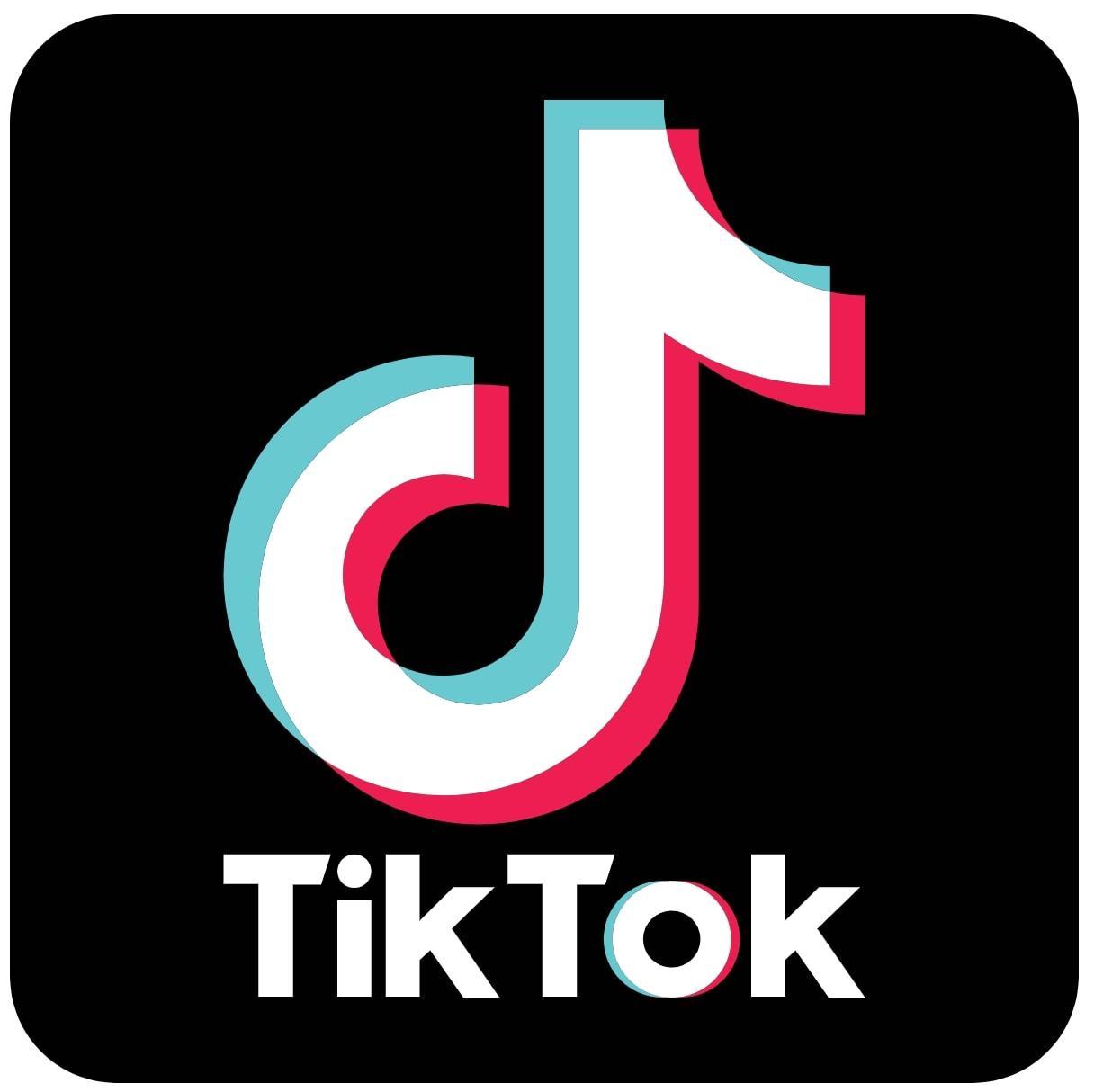
The TikTok logo, resembling a musical note with a neon glow, symbolizes sound and rhythm, capturing the platform’s focus on music and trends. The dual-tone colors mimic stage lights, hinting at performance and creativity, making the logo visually striking and engaging.
Originally designed to appeal to a Gen Z audience, the logo blends elements of music, video, and visual identity seamlessly. The black background enhances contrast and drama, ensuring that the logo pops on screens and remains memorable.
33. Spotify Soundwaves: Music Without Borders

The Spotify logo features three curved lines suggesting soundwaves or Wi-Fi, symbolizing seamless digital streaming and music without borders. The green color was chosen for its fresh, energetic, and unconventional feel, making the logo stand out in the digital landscape.
The circle shape reflects inclusivity and community in listening, ensuring that the logo is instantly recognizable and scalable across mobile and desktop platforms. The redesign in 2013 introduced a flatter, more modern look, enhancing the logo’s appeal and effectiveness.
34. Netflix “N”: Storytelling in Red
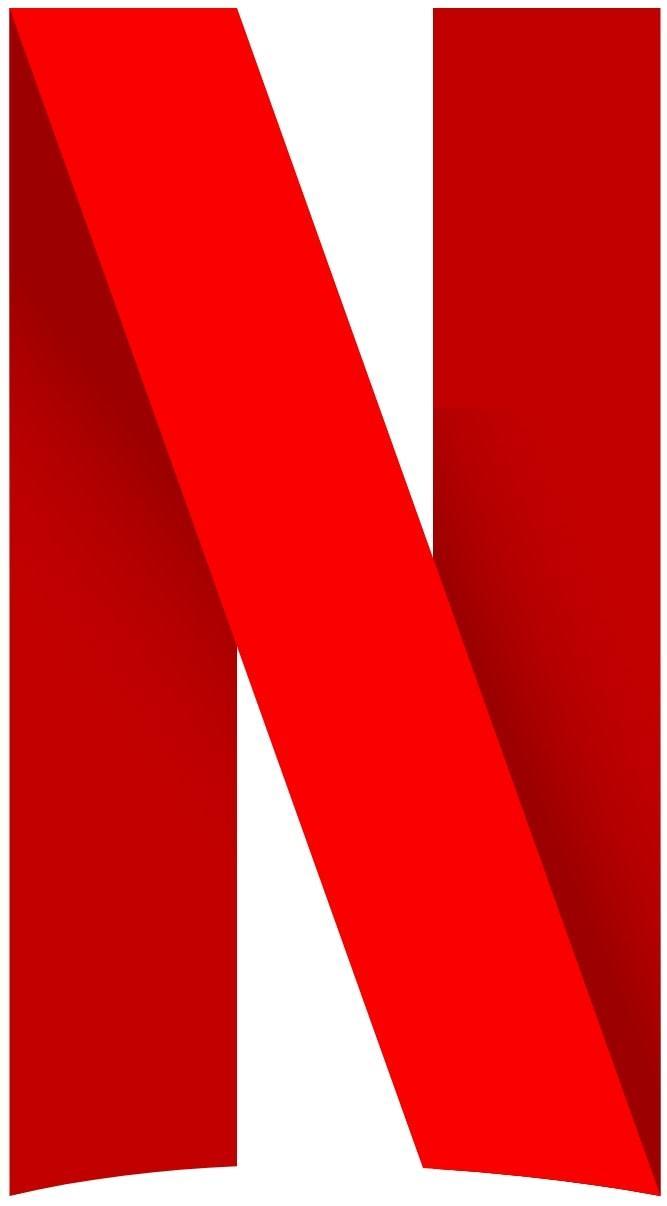
The Netflix “N” logo, with its folded-ribbon design, suggests depth, dimension, and layers of storytelling, perfectly capturing the essence of the platform. The red color, retained from the original logo, evokes passion and cinematic energy, making the logo visually striking and memorable.
The minimalist “N” works well as an app icon and loading animation, ensuring that it remains effective and recognizable across various digital contexts. This sleek, high-end design aligns with Netflix’s original content strategy, reinforcing the brand’s identity as a leader in visual entertainment.
35. Telegram Paper Plane: Speed and Security

The Telegram logo features a white paper plane, symbolizing fast and direct messaging. The sky-blue background reflects openness, clarity, and digital fluidity, enhancing the logo’s visual appeal and effectiveness. The design emphasizes Telegram’s focus on privacy and freedom of communication, ensuring that the logo is instantly recognizable across platforms.
The paper plane metaphor conveys lightness, speed, and independence, making the Telegram logo a powerful symbol of modern communication.
36. WhatsApp Chat Bubble: Everyday Connection

The WhatsApp logo features a chat bubble with a phone inside, symbolizing the platform’s core mission of fast, free, and encrypted messaging. The green color represents trust, growth, and peaceful communication, making the logo visually appealing and meaningful.
The bubble shape makes the logo intuitive and friendly for users, ensuring global recognition across languages and cultures. The simplicity of the design supports WhatsApp’s mission of everyday connection, making the logo a standout symbol in digital communication.
37. Reddit Alien: Community and Curiosity

Reddit’s mascot, “Snoo,” is a white alien with an antenna, representing curiosity and exploration. The orange color symbolizes creativity and nonconformity, aligning with Reddit’s community-driven humor and culture.
Snoo’s playful expression and circular head make it friendly and cartoon-like, enhancing its appeal and recognizability. The antenna suggests communication, connection, and the reception of ideas, making the Reddit logo a powerful symbol of online community and curiosity.
38. Twitch Glitch Logo: Streaming Culture

The Twitch logo features a bold, blocky wordmark and the “Glitch” — a stylized purple chat bubble that emphasizes chat, interaction, and digital presence. Purple symbolizes creativity, individuality, and gamer culture, making the logo visually striking and relevant.
The sharp angles and retro style evoke 8-bit aesthetics, appealing to both gamers and live streamers. The dynamic and energetic design of the Twitch logo perfectly matches the fast-paced content and streaming culture it represents.
39. Dropbox Box: Simplicity in Storage
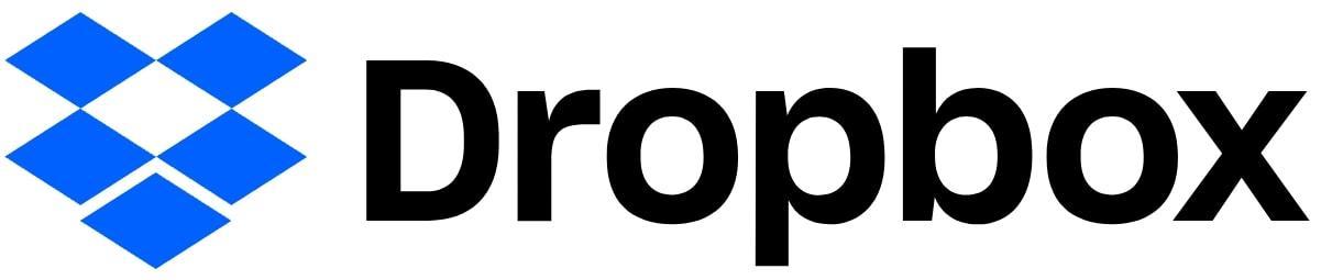
The Dropbox logo, depicting an open box, symbolizes storage and accessibility, perfectly capturing the essence of the brand. The blue color was chosen for its calmness, organization, and trust, making the logo visually appealing and meaningful.
The redesign in 2017 introduced more geometric abstraction, enhancing the logo’s modernity and effectiveness. The box suggests order, sharing, and digital flexibility, making the Dropbox logo a standout symbol of simplicity in storage.
40. PayPal Double P: Secure Transactions
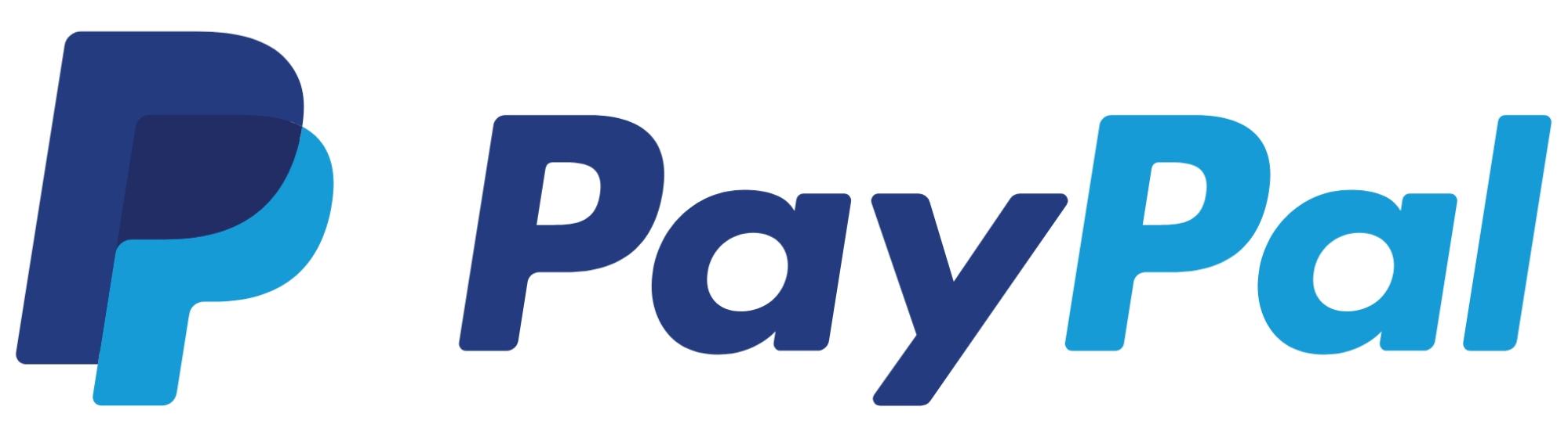
The PayPal logo features overlapping “P” letters, symbolizing partnership and layered security. The blue tones represent trust, financial stability, and professionalism, making the logo visually appealing and meaningful.
The interlocking letters suggest digital flow and secure movement of funds, ensuring the logo is optimized for app usage and transactional interfaces. The slanted angles give the logo a sense of motion and progress, making it a powerful symbol of secure transactions.
41. Intel Logo: Powering the Digital World
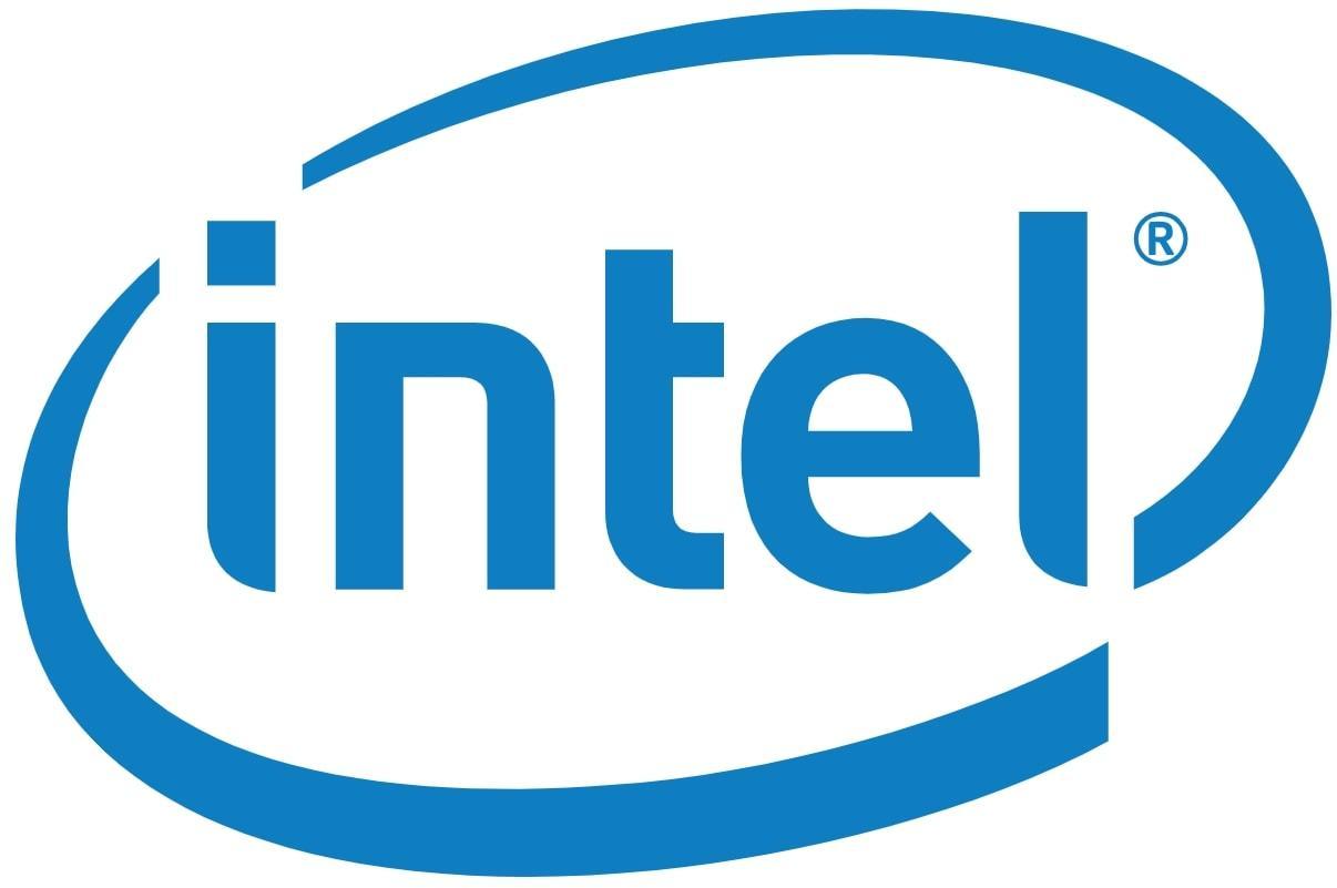
The Intel logo features a clean, minimalist wordmark, reflecting a shift from earlier swirls and swooshes. The blue color represents intelligence, trust, and technological innovation, making the logo visually appealing and meaningful. The logo also reflects the brand’s rich history in microprocessor innovation, symbolizing Intel’s longstanding legacy in the tech industry.
The design is neutral but forward-looking, with strong geometric balance, ensuring the logo remains effective across various platforms. The Intel logo accompanies the brand’s iconic chime in advertisements, reinforcing its identity as a leader in powering the digital world.
42. Windows Logo: Operating Systems Evolution
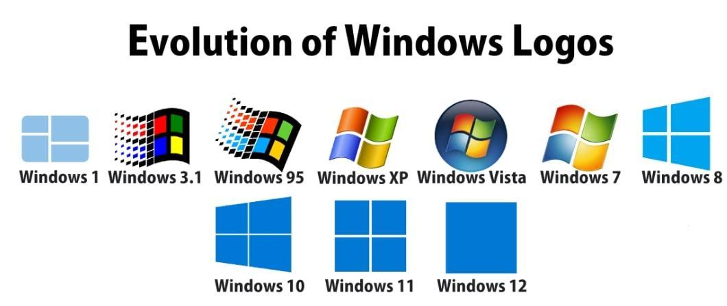
The Windows official logo evolved from a four-color pane to a simplified blue window, symbolizing motion, flexibility, and digital openness. The blue tones communicate calm, reliability, and familiarity, making the logo visually appealing and meaningful.
The flat, grid-based look reflects modern UI design, ensuring the logo aligns with system overhauls and remains effective across various platforms. The “window” metaphor emphasizes transparency and user control, making the Windows logo a powerful symbol of operating systems evolution.
The Microsoft logo, while distinct from the Windows logo, also embraces simplicity through its multicolored square design. This square symbolizes the company’s diverse product range and unified brand identity, using basic geometric shapes to convey a clear and approachable image. Both logos utilize simple forms effectively, reinforcing Microsoft’s commitment to clarity and accessibility across its brand portfolio.
43. Android Robot: Open-Source Innovation

The Android logo features a friendly green robot named “Bugdroid,” representing openness, adaptability, and playful innovation. The color green suggests growth, freshness, and tech progress, making the logo visually appealing and meaningful.
Designed to be modular and easily adapted by developers, the logo has been simplified over the years for better visibility and branding. Bugdroid is often customized in themes, merchandise, and events, making the Android logo a powerful symbol of open-source innovation.
44. Mozilla Firefox: Fast, Open, Reliable
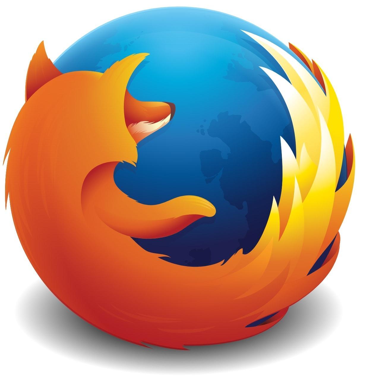
The Firefox logo features a stylized fox curled around a globe, representing speed, global access, and open internet values. The fox’s flame-like tail symbolizes agility and performance, making the logo visually appealing and meaningful.
The globe highlights Firefox’s commitment to web accessibility, ensuring the logo remains effective across various platforms. The design conveys warmth, friendliness, and user empowerment, making the Firefox logo a powerful symbol of fast, open, and reliable internet access.
45. Tesla “T”: Innovation and Energy
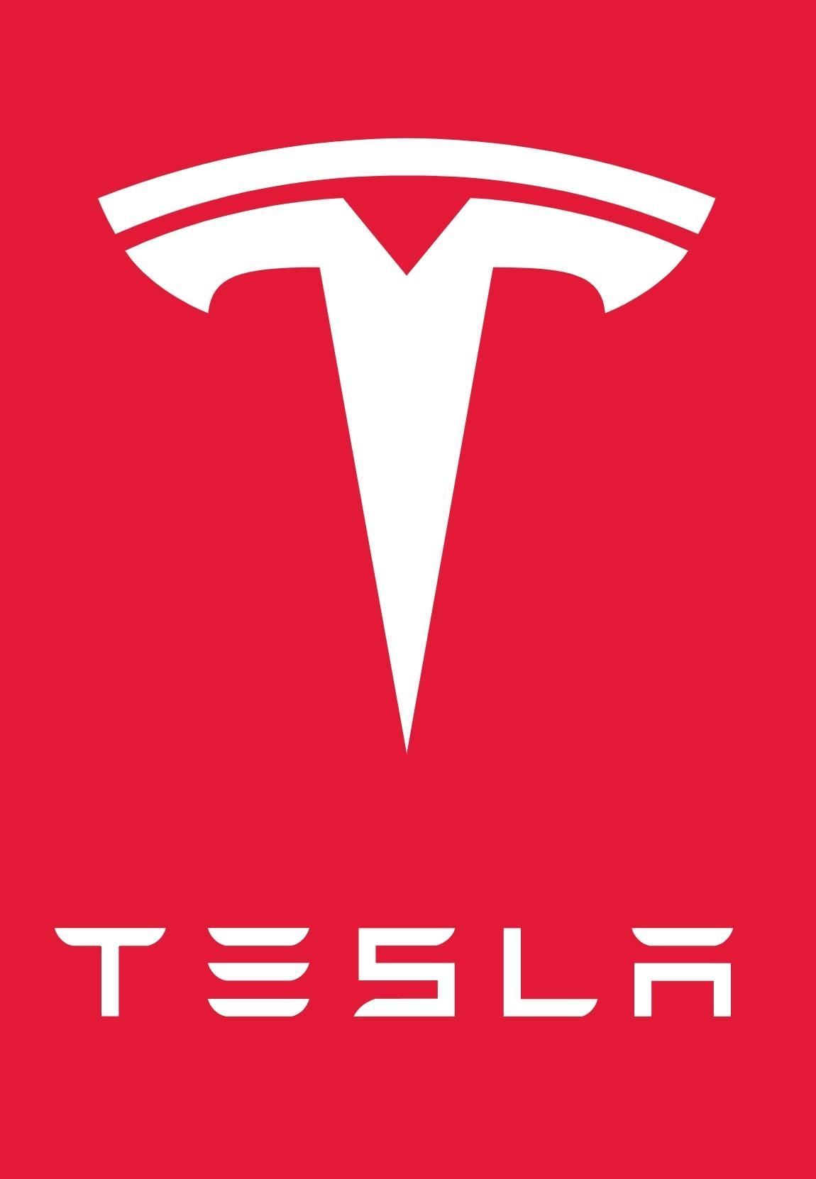
The Tesla “T” logo resembles a cross-section of an electric motor, symbolizing the company’s focus on technological precision and innovation. The minimalist design reflects modernity and forward-thinking, making the logo visually appealing and meaningful.
Red and silver variants express boldness and industrial strength, aligning with Tesla’s image as a disruptor in automotive innovation. The “T” shape also suggests a shield, hinting at protection and energy, making the Tesla logo a powerful symbol of innovation and energy.
46. SpaceX Wordmark: Futuristic Simplicity

The SpaceX logo uses a sleek wordmark with an arched “X” resembling a rocket path, reflecting aerospace ambition and forward motion. The font is custom and angular, suggesting sharpness and precision, making the logo visually appealing and meaningful.
The stylized “X” conveys dynamic flight and orbital trajectory, enhancing the logo’s modernity and effectiveness. The minimalist design aligns with high-tech branding, ensuring the SpaceX logo remains a powerful symbol of futuristic simplicity.
47. Uber Wordmark: Global Transport Identity

Uber’s current logo is a minimalist wordmark in bold black font, reflecting clarity, neutrality, and global appeal. The design replaced the earlier abstract “bit” icon in 2018, ensuring the logo is more recognizable and effective.
The black-and-white theme emphasizes professionalism and flexibility, making the logo scalable for car windows, apps, and signage. This evolution reflects Uber’s shift from disruptor to an established mobility platform, making the logo a powerful symbol of global transport identity.
48. Airbnb Bélo: Belonging Everywhere
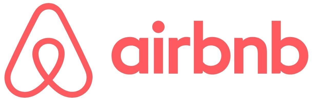
The Airbnb “Bélo” logo combines a heart, location pin, and A-shape, symbolizing belonging, love, and travel in a single form. Introduced in 2014, the logo replaced the original wordmark to enhance global appeal and emotional resonance.
The icon is abstract but emotionally resonant, with soft curves and symmetry evoking openness and friendliness. The design adapts well to app icons, signage, and merchandise, making the Airbnb logo a powerful symbol of belonging everywhere.
49. IKEA Blue and Yellow: Accessible Design
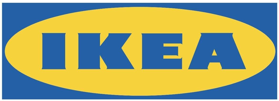
The IKEA logo, with its bold yellow letters inside a blue oval, is a reflection of the brand’s Swedish heritage. The choice of blue and yellow, the national colors of Sweden, strengthens this connection and enhances brand identity. The oval shape suggests inclusivity and balance, aligning with IKEA’s mission to provide accessible and affordable design.
The strong, sans-serif font communicates practicality and simplicity, making the logo easily recognizable and effective across various platforms. The consistency of the logo’s design over the decades has reinforced IKEA’s brand stability and reliability, making it a trusted symbol of accessible design.
50. Ferrari Horse: Speed and Prestige
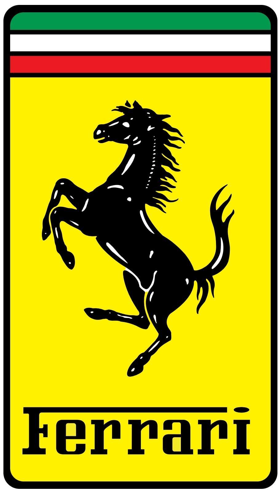
The Ferrari logo, featuring a black prancing horse on a yellow background, is a powerful symbol of speed and prestige. The horse was originally used by WWI flying ace Francesco Baracca, and Enzo Ferrari adopted it as a tribute, symbolizing power and agility. The yellow background represents the city of Modena, Ferrari’s birthplace, adding a layer of heritage to the logo.
The logo includes the letters “S F” for Scuderia Ferrari, further emphasizing its racing heritage. The Italian flag stripes above the horse reinforce national pride, making the Ferrari logo a powerful emblem of Italian craftsmanship and automotive excellence.
51. LEGO Brick Logo: Creativity in Play
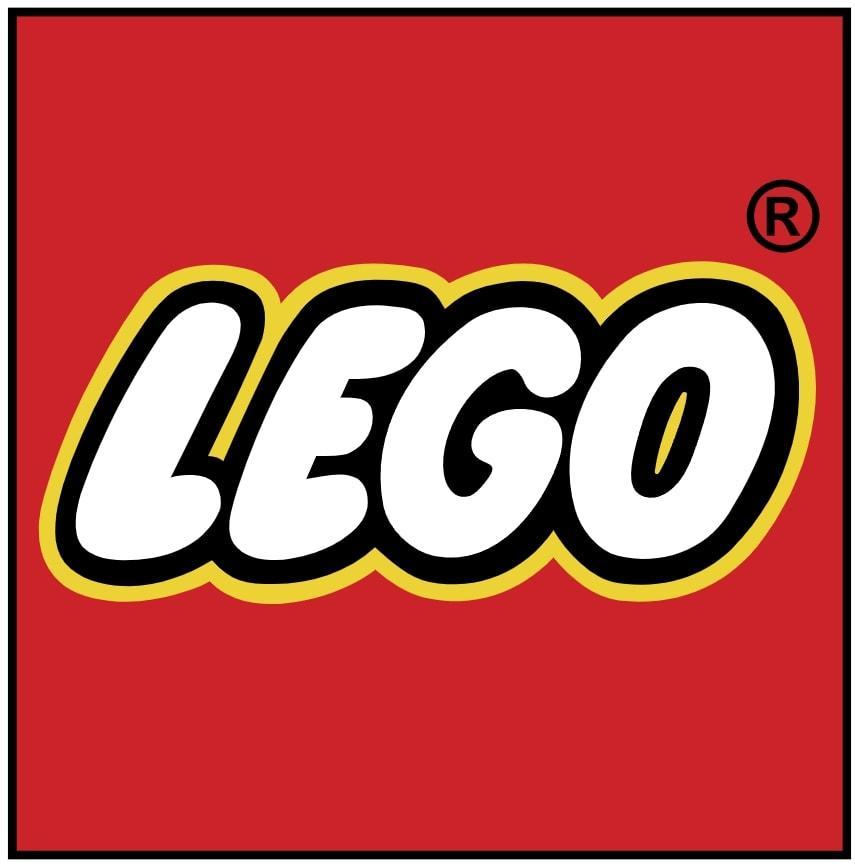
The LEGO logo, with its bright red, white, and yellow colors, is designed to attract children’s attention and evoke a sense of playfulness and creativity. The bold, rounded font reflects the brand’s focus on fun and innovation, making the logo instantly recognizable and engaging.
Introduced in 1955, the LEGO logo has evolved subtly over the years while maintaining its core elements. The name “LEGO” is derived from the Danish words “leg godt,” meaning “play well,” emphasizing the brand’s commitment to quality and creativity in play.
The logo’s consistency across all products reinforces brand logo unity and recognition.
52. Sony Wordmark: Precision and Quality
Sony’s logo features a simple, elegant serif wordmark that conveys sophistication and clarity. The black text on a white background emphasizes precision in engineering and consistency in design, making the logo visually appealing and meaningful.
The font has remained largely unchanged since 1957, reflecting Sony’s emphasis on substance over style. This timeless design appears across Sony’s diverse range of electronics, entertainment, and gaming products, reinforcing the brand’s identity and commitment to quality.
53. Gucci Logo: Luxury and Legacy
The Gucci logo, featuring two interlocking Gs, represents the initials of founder Guccio Gucci and symbolizes symmetry, elegance, and exclusivity. Often used in gold, black, or white, the logo reflects luxury and timeless appeal.
The double-G logo appears on a wide range of products, including clothing, bags, accessories, and fragrances, making it a status symbol worldwide. The design emphasizes Gucci’s rich fashion heritage, ensuring that the logo remains a powerful emblem of luxury and legacy.
54. H&M: Fast Fashion Identity
The H&M logo, with its bold, red handwritten-style letters, reflects the brand’s energy and affordability. The red color draws attention and evokes a sense of excitement, making the logo visually striking and engaging.
The logo’s simplicity and adaptability make it effective for a global retail presence, appearing on storefronts, tags, and marketing materials worldwide. The brand name, which stands for Hennes & Mauritz, emphasizes the brand’s history and commitment to fast fashion.
The H&M logo successfully balances fashion and accessibility, making it one of the famous brand most recognizable brands in the world.
55. Zara: Minimalist Retail Icon
The Zara logo features a modern serif wordmark in black, reflecting elegance, timelessness, and versatility. In 2019, the logo was redesigned with overlapping, high-contrast letters to elevate the brand towards luxury fashion aesthetics. Despite initial controversy, the redesign helped Zara stand out in the competitive retail market.
The minimalist wordmark aligns with Zara’s fast fashion business model, ensuring the logo remains effective and recognizable.
56. Puma Jumping Cat: Speed and Style
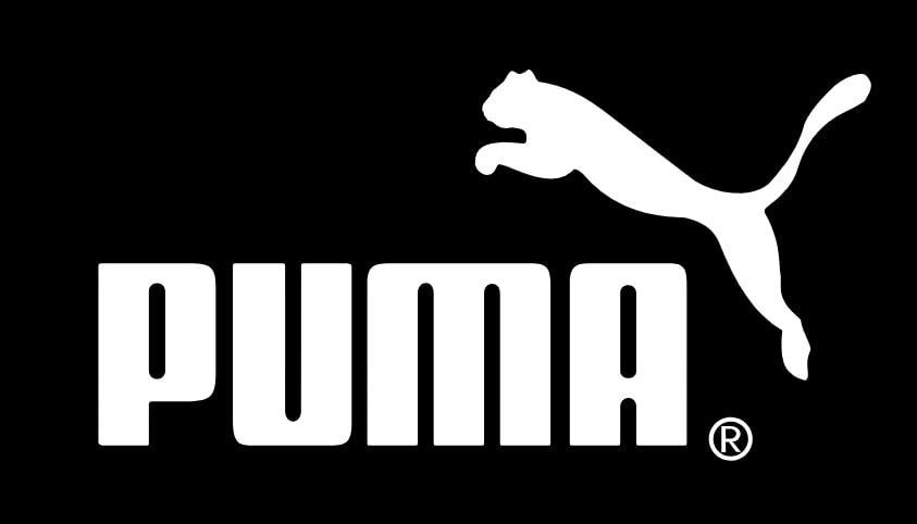
The Puma logo, featuring a leaping black panther, symbolizes agility, speed, and confidence. This powerful design element has been in use since 1948, undergoing minor refinements to maintain its relevance and impact.
The logo works well across a wide range of products, including apparel, footwear, and sports equipment, making it a versatile and effective brand symbol. The black color represents strength and intensity, enhancing the logo’s visual appeal and memorability.
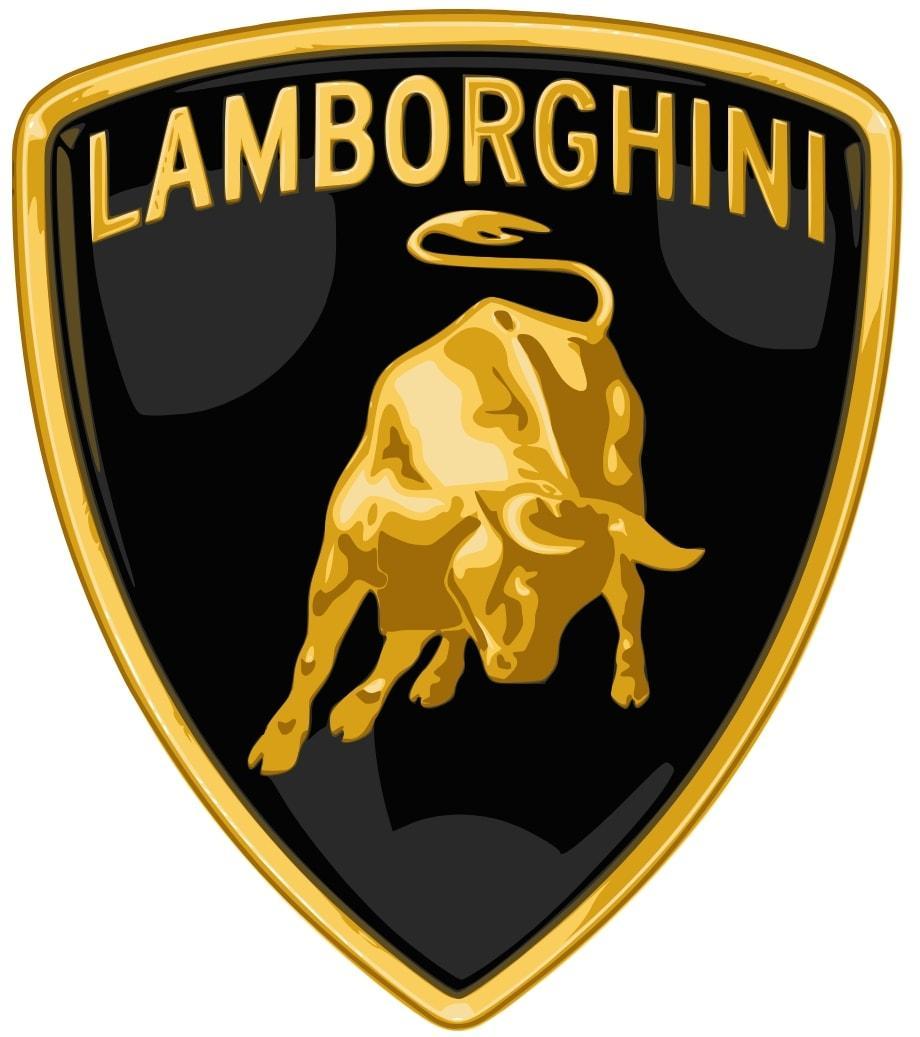
57. Lamborghini Bull: Power and Prestige
The Lamborghini logo, featuring a golden bull inside a black shield, reflects founder Ferruccio Lamborghini’s zodiac sign, Taurus. The bull symbolizes strength, determination, and aggressive performance, perfectly capturing the brand’s essence. The shield shape suggests protection and exclusivity, while the gold and black colors project luxury and boldness.
The logo aligns with Lamborghini’s tradition of naming cars after bulls, making it a powerful symbol of power and prestige.
58. The North Face: Exploration and Performance
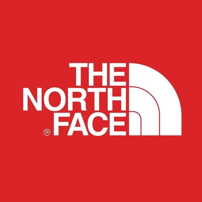
The North Face logo features a quarter-circle shape inspired by Half Dome in Yosemite, symbolizing exploration, resilience, and outdoor endurance. The clean sans-serif typography conveys utility and modern design, making the logo visually appealing and effective.
The black and white color palette emphasizes contrast and clarity, ensuring the logo remains recognizable across various products and platforms. The arc represents both physical peaks and personal challenges, making The North Face logo a powerful symbol of exploration and performance.
59. Patagonia Mountain: Environmental Commitment
Patagonia’s logo, featuring the silhouette of the Fitz Roy mountain range, reflects the brand’s deep connection to nature and the outdoors. The multicolor sunset gradient adds warmth and uniqueness, enhancing the logo’s visual appeal and effectiveness. The mountain peaks symbolize adventure and authenticity, aligning with Patagonia’s commitment to environmental activism.
The bold and straightforward typeface matches the brand’s rugged ethos, making the Patagonia logo a powerful symbol of environmental commitment and outdoor exploration.
60. Harley-Davidson Bar & Shield: Rebellion and Freedom
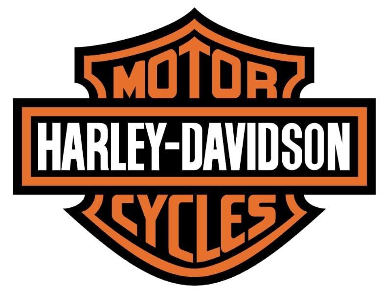
The Harley-Davidson logo features a bold shield shape with a horizontal bar reading “Harley-Davidson Motor Co.,” symbolizing strength, rebellion, and the American spirit. The black and orange color scheme conveys power and confidence, enhancing the logo’s visual appeal and memorability.
The design has remained largely unchanged since 1910, evoking the freedom of the open road and individuality. The shield shape suggests protection and legacy, making the Harley-Davidson logo a powerful symbol of rebellion and freedom.
61. John Deere Deer: Agricultural Power
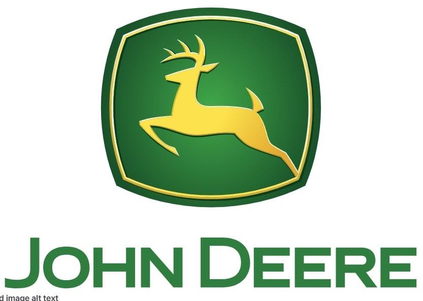
The John Deere logo, featuring a leaping deer, symbolizes progress and reliability in the agricultural sector. The green and yellow colors represent farming, nature, and growth, enhancing the logo’s visual appeal and effectiveness. The upward-jumping deer reflects forward momentum, while the design’s evolution over time underscores the brand’s commitment to innovation and trust, making the John Deere logo a powerful symbol of agricultural power and innovation.
The logo has evolved through eight major design updates since 1876, with the current version introduced in 2000 being the most modernized. The upward-jumping deer reflects forward momentum, making the John Deere logo a powerful symbol of agricultural power and innovation.
62. Chanel Interlocked Cs: Fashion Elegance
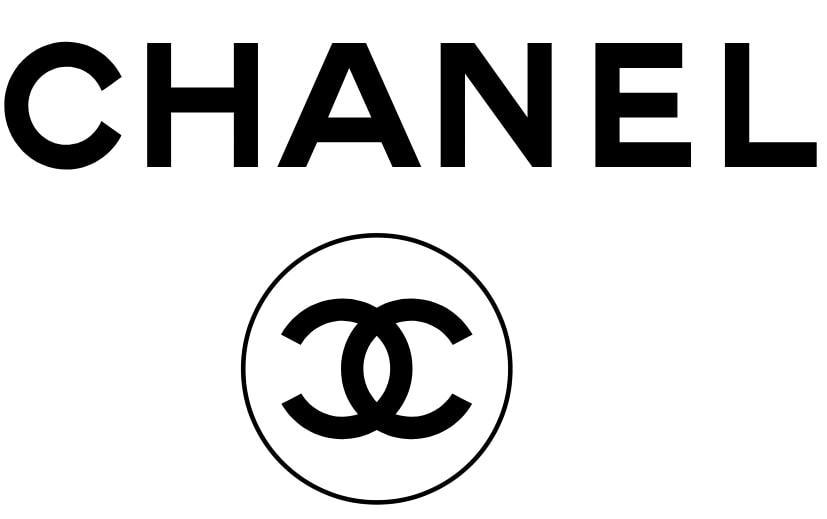
The Chanel logo, featuring two interlocked “C” letters facing away from each other, represents the initials of founder Coco Chanel. Designed by Gabrielle ‘Coco’ Chanel in 1925, the logo embodies geometric simplicity and sophistication. The black and white color schemes reflect timeless elegance, making the logo visually appealing and meaningful.
Introduced in the 1920s, the design has remained unchanged, emphasizing Chanel’s commitment to tradition and luxury. The symmetry of the Cs conveys luxury, balance, and refinement, making the Chanel logo a powerful symbol of fashion elegance.
63. Louis Vuitton Monogram: High-End Craftsmanship
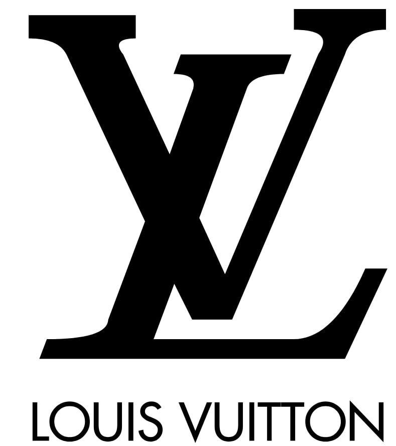
The Louis Vuitton monogram combines the initials “L” and “V” in an elegant serif font, designed in 1896 to prevent counterfeiting. The logo is often accompanied by floral motifs in the monogram pattern, reflecting the heritage of fine French leather goods.
The brown and gold tones evoke vintage luxury and warmth, making the logo visually appealing and meaningful. The logo appears on a wide range of products, including luggage, handbags, and fashion accessories, reinforcing Louis Vuitton’s reputation for high-end craftsmanship.
64. Panasonic: Reliability and Longevity
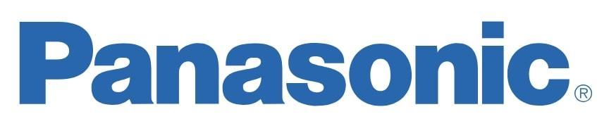
The Panasonic logo features:
- A clean blue wordmark with no additional symbols, emphasizing clarity and stability.
- A blue color that represents trust, technology, and professionalism, making the logo visually appealing and meaningful.
- A bold and modern font, highlighting innovation and reliability.
These elements ensure the logo remains effective across various products and platforms.
The name combines “pan” (all) and “sonic” (sound), reinforcing Panasonic’s commitment to customer satisfaction and technological advancement.
65. Prada Wordmark: Sophisticated Simplicity
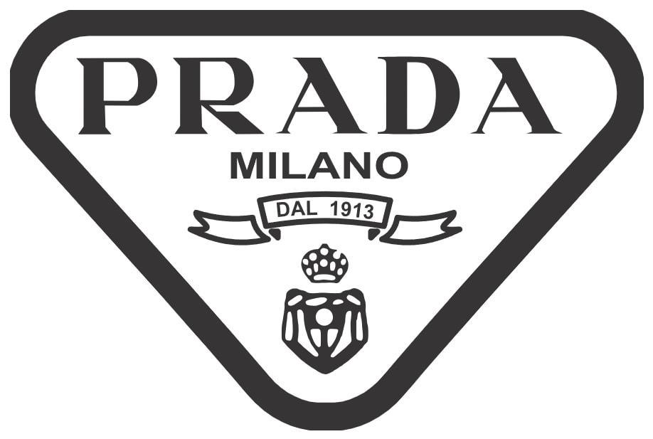
The Prada logo shows:
- A refined black serif wordmark, emphasizing heritage and sophistication
- A classic and elegant font style, making the logo visually appealing and meaningful
- No graphic elements, using pure typography
This design communicates luxury through restraint and clarity.
The Prada logo often appears embossed or printed in silver or black, reinforcing the brand’s identity as a symbol of sophisticated simplicity.
66. Reebok Vector: Athletic Identity
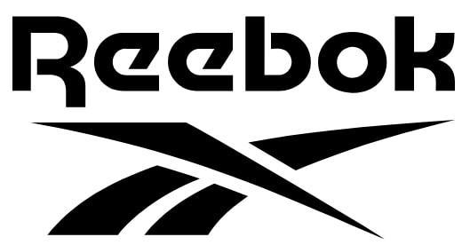
The Reebok logo features an abstract vector symbol resembling motion and energy, reflecting the brand’s focus on speed, performance, and agility. The design has evolved from the Union Jack to the current minimal mark, ensuring the logo remains relevant and effective.
The vector shape can resemble a stylized letter “R,” adding a layer of meaning to the logo. Often used in red, black, or white, the logo is paired with a bold typeface for modern athletic appeal, making Reebok a powerful symbol of athletic identity.
67. ASICS: Advanced Sports Technology
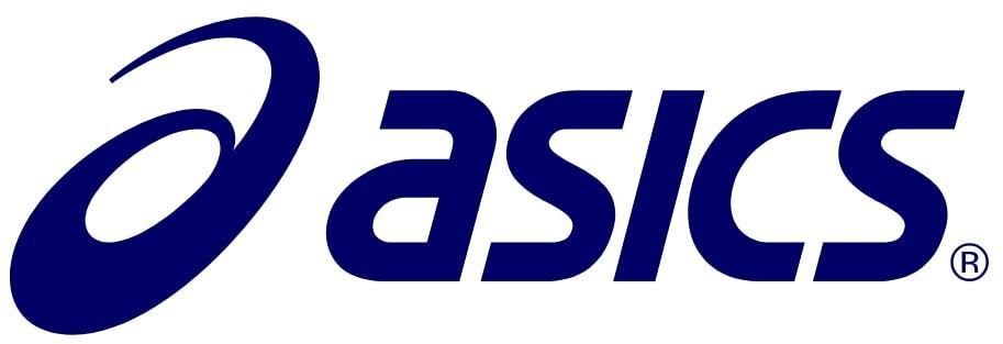
The ASICS logo, standing for “Anima Sana In Corpore Sano” — “A Sound Mind in a Sound Body,” includes a stylized swirl “a” resembling motion. The blue tones are often used to signify calm and technical precision, making the logo visually appealing and meaningful.
The swirl hints at movement, focus, and energy cycles, ensuring the logo remains effective across running shoes and performance gear worldwide. The logo is paired with a modern sans-serif wordmark, reinforcing ASICS’s commitment to advanced sports technology.
68. New Balance “NB”: Balanced Performance
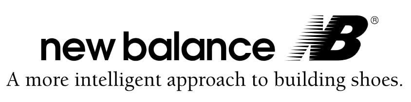
The New Balance logo consists of:
- Bold, italicized “NB” initials
- Horizontal lines within the letters suggesting motion and momentum
- An italic angle that reflects speed and forward movement
These elements make the good logo visually appealing and meaningful.
The simple design supports product focus and heritage, ensuring the logo remains effective and recognizable. Often used in red, black, or white, the logo is paired with a sans-serif wordmark or used standalone, reinforcing New Balance’s reputation for balanced performance.
69. Lacoste Crocodile: Elegance in Casual Wear
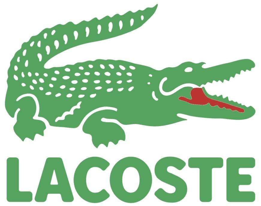
The Lacoste logo features a green crocodile with a red mouth, inspired by tennis player René Lacoste’s nickname, “The Crocodile”. The animal symbolizes tenacity, precision, and elegance, making the logo visually appealing and meaningful.
One of the first logos ever embroidered on apparel, the design has remained largely unchanged since the 1930s, appearing primarily on polo shirts and casualwear. The Lacoste logo is a powerful symbol of elegance in casual wear, reinforcing the brand’s identity and heritage.
70. FILA Wordmark: Sport and Heritage
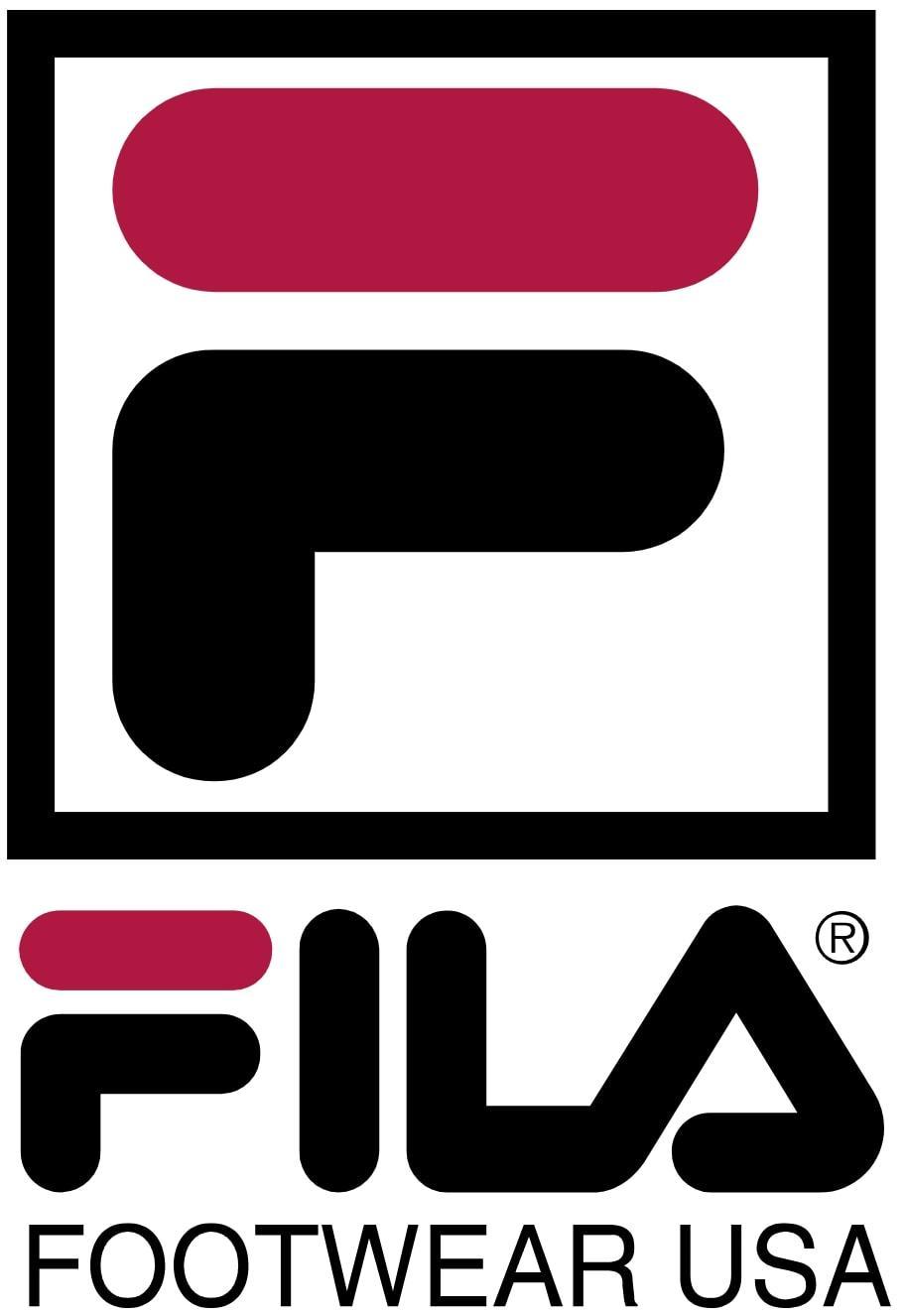
The FILA logo features a stylized blue-and-red wordmark with bold geometric letters, reflecting the brand’s focus on sport and heritage. The square “F” became an icon in itself, often used standalone, enhancing the logo’s visual appeal and effectiveness.
The red bar represents passion, while the blue base signifies stability, making the logo visually appealing and meaningful. The typeface has a retro-futuristic vibe, linked to 80s and 90s fashion, ensuring the FILA logo remains relevant and recognizable across tennis, basketball, and streetwear collections.
71. Champion Script Logo: Legacy of Performance
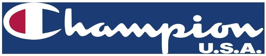
The Champion logo features a flowing cursive wordmark with a distinct “C” emblem, reflecting the brand’s American roots and heritage. The red-white-blue “C” symbolizes tradition and athletic culture, making the logo visually appealing and meaningful.
Originally focused on sports uniforms in the early 20th century, the logo appears on a wide range of products, including sweatshirts, hoodies, and team apparel. The Champion logo has seen a major resurgence in streetwear and retro fashion, reinforcing its legacy of performance.
72. Columbia Logo: Outdoor Innovation
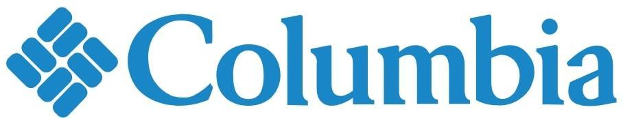
The Columbia logo features a diamond grid of woven shapes, symbolizing textiles and the brand’s focus on warmth, resilience, and technical apparel. The blue color reflects sky, water, and exploration, making the logo visually appealing and meaningful.
The geometric, clean-cut aesthetic enhances the logo’s modernity and effectiveness, ensuring it remains recognizable across various products. The Columbia logo combines performance with casual outdoor style, making it a powerful symbol of outdoor innovation.
73. Under Armour Interlock: Strength and Discipline
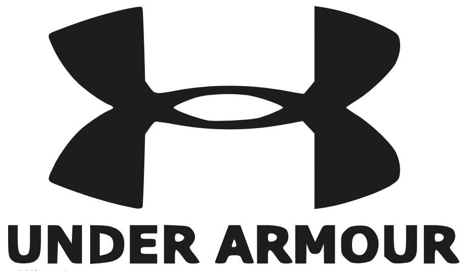
The Under Armour logo consists of two interlocking “U” and “A” elements, symbolizing protection, performance, and innovation. The symmetrical design implies discipline and intensity, making the logo visually appealing and meaningful.
The black and white color scheme emphasizes raw athleticism, ensuring the logo remains effective and recognizable across various products. Created in 1996, the Under Armour logo rapidly gained recognition in training circles, reinforcing the brand’s identity and commitment to strength and discipline.
74. Vans Off The Wall: Street Style and Skating
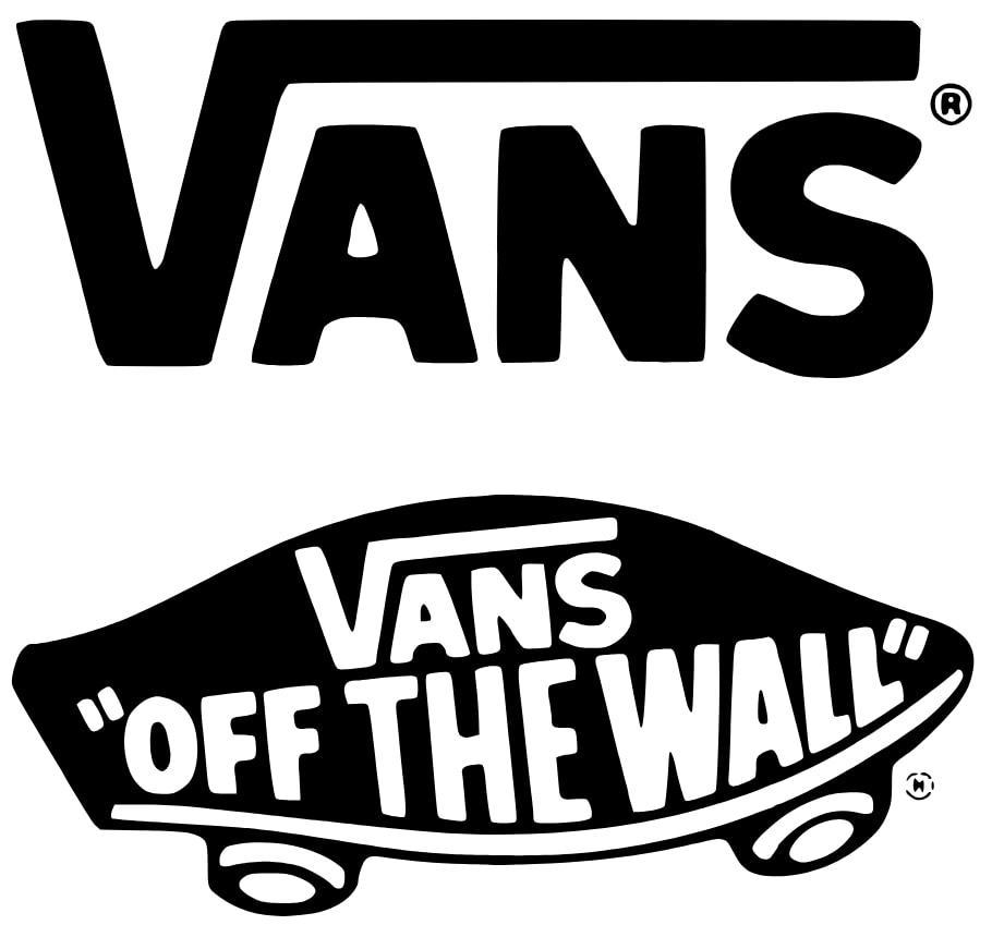
The Vans logo, with its distinctive stretched-out wordmark and skateboard-inspired “V” ramp, captures the essence of skate culture and rebellious creativity. The phrase “Off The Wall” refers to skateboard tricks and embodies the brand’s commitment to youth energy and street style.
Red or black variants of the logo are most commonly used, ensuring versatility and bold visual appeal. Originating in California in the 1960s, the logo’s bold and dynamic typography reflects the brand’s deep roots in skateboarding and street culture, making it an enduring symbol of style and innovation.
75. Clideo: Use Logos in Motion – Enhance Your Brand Content

Clideo is a company that develops a video editor to create professional, eye-catching videos, even for beginners, which is available not only in the browser but also as a convenient iOS app.
The Clideo logo features a stylized play button icon alongside a clean, lowercase wordmark. The triangular play button, with its rounded corners and dynamic gradient from blue to green, instantly communicates the brand’s focus on video content while conveying a sense of motion and modernity. The blue and green hues evoke trust, creativity, and innovation, reflecting a seamless user experience. The simple sans-serif font of the word “clideo” adds a friendly and approachable feel, emphasizing clarity and ease of use. Overall, the logo projects professionalism, creativity, and accessibility, making it instantly recognizable and inviting to a wide range of users.
Best Logos Summary
As we journeyed through the world of iconic logos, we discovered the immense power these symbols hold in forging connections between brands and consumers. From the minimalist elegance of the Apple logo to the timeless script of Coca-Cola, each logo tells a unique story that encapsulates the brand’s core values and identity. These logos do more than just identify a brand; they evoke emotions, build trust, and create lasting impressions. Oreo stands out as the most famous brand of chocolate cookies, known for its long history since 1912 and its global appeal.
Victory and Comfort: Nike and McDonald’s
We explored how logos like the Nike Swoosh and the McDonald’s Golden Arches have become symbols of victory and comfort, respectively, while the hidden arrow in the FedEx logo and the overlapping circles of Mastercard demonstrate the clever use of design to convey deeper meanings.
Evolution of Famous Brands: Google and Instagram
The evolution of logos such as Google’s and Instagram’s highlights the importance of staying relevant and adaptable in a rapidly changing digital landscape.
Luxury and Innovation: Rolex, Gucci, Tesla, and SpaceX
The journey also took us through luxury with the Rolex crown and the Gucci interlocking Gs, as well as innovation with the Tesla “T” and the SpaceX wordmark. Each logo, whether simple or intricate, minimalist or vibrant, plays a crucial role in shaping our perceptions and experiences with the brand it represents.
Logos with a Message: YouTube and Clideo
The YouTube logo, featuring a red play button, conveys the brand’s core message of instant video playback and entertainment. The play button symbolizes action and engagement, making it a powerful visual that connects with users worldwide. Similarly, the Clideo logo uses a stylized play button with a clean, lowercase wordmark to highlight its focus on video editing. Its dynamic colors evoke creativity, while the simple design ensures clarity and approachability. Both logos effectively communicate their brand’s purpose in the digital media landscape.
Conclusion: The Power of Iconic Logos
In conclusion, the logos we see every day are powerful tools of communication, embodying the essence of the brands they represent. As we continue to interact with these symbols, we gain a deeper appreciation for the artistry and strategy behind their designs. Whether you’re a business owner, a marketer, or simply a curious reader, understanding the power of iconic logos can inspire you to create a strong and memorable brand identity. Let these stories of iconic logos inspire you to think creatively and strategically about your own brand’s visual identity.
Frequently Asked Questions
What makes a logo iconic?
An iconic logo is characterized by its ability to create a strong emotional connection with consumers, be easily recognizable, and effectively communicate the brand’s core values and identity. These elements work together to ensure the logo stands out and resonates with its audience.
Why did Apple change its logo to a more minimalist design?
Apple changed to a more minimalist logo design to emphasize simplicity and clarity, ensuring better recognizability in a visually cluttered world. This shift reflects their commitment to clean design principles.
What is the hidden message in the Amazon logo?
The hidden message in the Amazon logo is the arrow from ‘A’ to ‘Z,’ which signifies the company’s extensive product range and dedication to customer satisfaction.
How does the FedEx logo use negative space effectively?
The FedEx logo effectively utilizes negative space by incorporating a hidden arrow between the ‘E’ and ‘x,’ symbolizing speed and efficiency, which enhances brand recognition and memorability.
Why are animated logos becoming popular?
Animated logos are gaining popularity because they enhance brand engagement by adding visual interest and creating smooth transitions, making digital content more captivating.