At Worldvectorlogo, we know that logos are more than just shapes—they’re emotional triggers that define a brand’s identity. One of the most powerful tools in logo design is color, which can evoke feelings, convey values, and create instant connections with audiences. This article explores the fascinating world of color psychology in logo design, highlighting five brands that use color strategically to shape perceptions and build unforgettable identities.
Why Color Matters in Logo Design
Colors aren’t just aesthetic choices; they’re psychological cues that influence how people perceive a brand. Red might spark excitement, blue builds trust, and green suggests growth. A well-chosen palette can make a logo memorable and align it with a brand’s mission. For Worldvectorlogo’s audience, understanding color psychology is key to creating logos that resonate across cultures and contexts. Let’s dive into five brands that master color to forge emotional bonds.
1. McDonald’s: Golden Arches, Warm Vibes
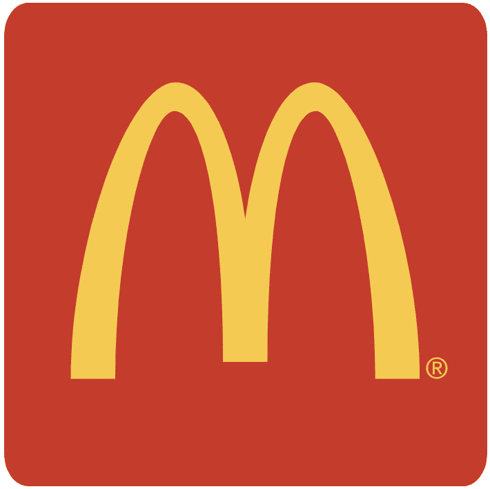
McDonald’s iconic golden arches on a red background are a global beacon of fast food. Red grabs attention and stimulates appetite, while yellow radiates warmth and happiness, making the brand feel approachable. This bold palette pops on signage and packaging, creating an energetic, welcoming vibe. McDonald’s proves that high-contrast colors can make a logo instantly recognizable and emotionally inviting.
2. IBM: Blue for Trust and Innovation
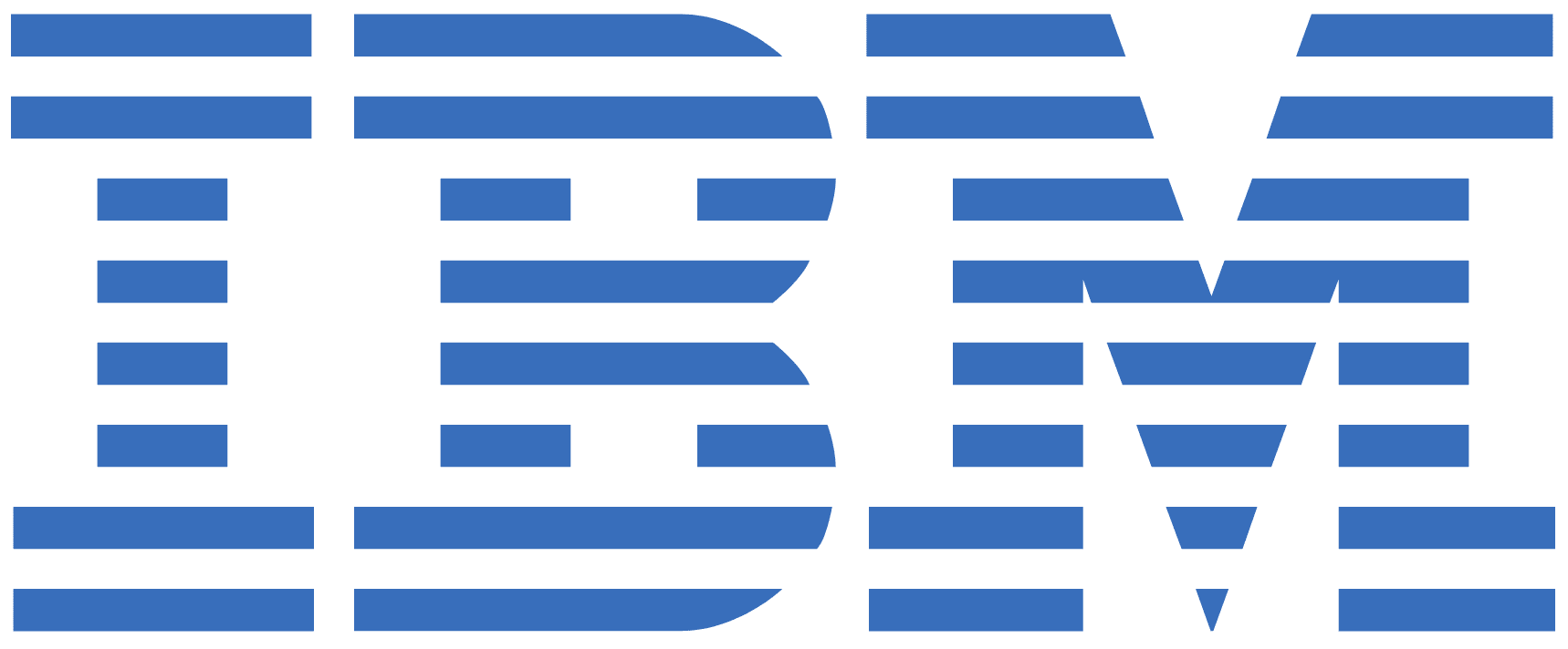
IBM’s logo, a striped wordmark in deep blue, exudes reliability and intelligence. Blue is synonymous with trust, professionalism, and stability—perfect for a tech giant. The consistent use of this cool tone across branding reinforces IBM’s image as a dependable innovator. By sticking to a single, powerful color, IBM shows how a restrained palette can convey authority and build confidence.
3. Spotify: Green for Growth and Creativity

Spotify’s vibrant green logo, a simple wordmark with a circular soundwave icon, screams energy and creativity. Green symbolizes growth, freshness, and innovation, aligning with Spotify’s mission to redefine music discovery. The bright hue stands out on app icons and marketing, making it youthful and dynamic. Spotify’s bold green choice proves that an unconventional color can define a modern brand.
4. Barbie: Pink Power and Playfulness
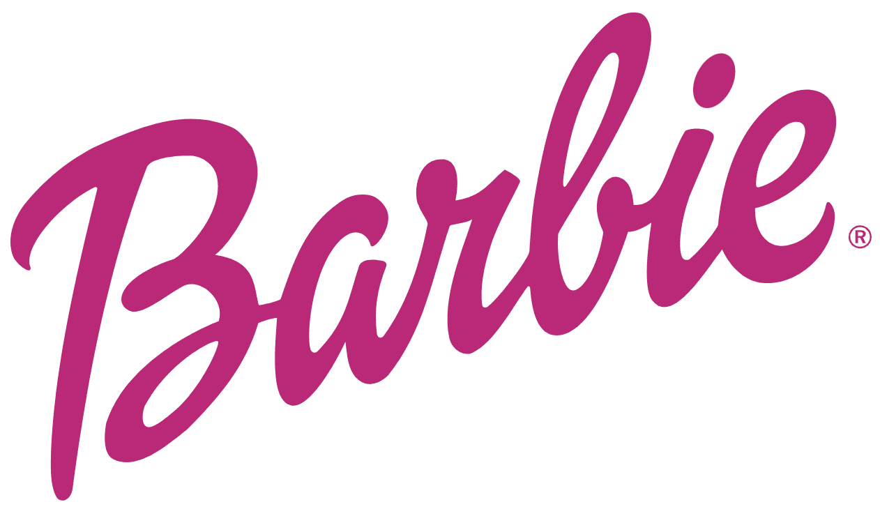
Barbie’s hot pink logo is a celebration of fun, femininity, and imagination. Pink evokes playfulness and approachability, instantly connecting with the brand’s youthful, creative audience. The vibrant shade dominates packaging, ads, and digital platforms, ensuring Barbie feels lively and empowering. Barbie’s fearless use of pink shows how a single color can become a brand’s emotional signature.
5. UPS: Brown for Dependability
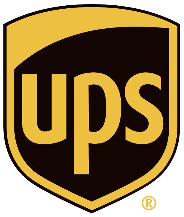
UPS’s logo, a shield with “UPS” in rich brown, is an outlier in a world of bright logos. Brown conveys reliability, earthiness, and strength—qualities that align with UPS’s promise of dependable delivery. The understated color makes the logo stand out in a sea of flashy competitors, proving that even a muted tone can carry weight. UPS demonstrates how an unexpected color can reinforce a brand’s core values.
Tips for Using Color in Your Logo Design
Color psychology is a game-changer for creating logos that connect emotionally. Here’s how to harness it for your brand:
- Know Your Audience: Choose colors that resonate with your target demographic’s emotions and cultural associations.
- Align with Values: Pick hues that reflect your brand’s mission—blue for trust, red for energy, green for sustainability.
- Keep It Simple: Limit your palette to 1-3 colors to ensure versatility and recognition.
- Test for Versatility: Ensure your colors work in monochrome, on dark or light backgrounds, and across digital and print.
- Consider Context: Research how colors are perceived in different cultures to avoid unintended meanings.
Conclusion
Color is the secret sauce of a logo’s emotional impact, turning simple designs into powerful brand ambassadors. At Worldvectorlogo, we’re passionate about helping designers craft logos that speak through color. Take inspiration from McDonald’s, IBM, Spotify, Barbie, and UPS to create a palette that captures your brand’s heart. Visit Worldvectorlogo.com to explore our vector logo resources and start designing with color that connects!