At Worldvectorlogo, we celebrate logos that say a lot with a little. Minimalist logo design strips away excess to create bold, memorable identities that thrive in a cluttered world. By focusing on simplicity, these logos achieve timeless versatility. This article explores the art of minimalism in logo design, highlighting five brands that master the “less is more” philosophy to forge powerful connections.
The Beauty of Minimalist Logos
Minimalist logos rely on clean lines, simple shapes, and restrained palettes to convey a brand’s essence. They’re versatile, scalable, and instantly recognizable, cutting through noise with clarity. For Worldvectorlogo’s audience, minimalism is a powerful tool to craft logos that endure. Let’s examine five brands that use simplicity to create iconic identities.
1. Apple: The Bite of Simplicity
Apple’s logo, a sleek, monochromatic apple with a single bite, is minimalism at its finest. Introduced in 1977, its smooth curves and lack of text exude innovation and elegance. It scales effortlessly from MacBooks to app icons. Apple’s stripped-down design proves that a single, refined shape can become a global symbol of sophistication.
2. Nike: A Swoosh That Soars
Nike’s Swoosh, a simple curved line, captures motion and ambition without words. Designed in 1971, it’s bold on sneakers, billboards, and digital platforms. The logo’s minimal form ensures instant recognition, embodying athleticism in one stroke. Nike shows how a single element can carry a brand’s spirit.
3. Google: Clean and Colorful
Google’s logo, a sans-serif wordmark in four primary colors, balances simplicity with playfulness. The clean typography and subtle color accents make it versatile for web, apps, and print. Its minimalist favicon—a multicolored “G”—thrives in small spaces. Google’s restrained design highlights how minimalism can still feel vibrant.
4. Uniqlo: Red Square, Bold Impact
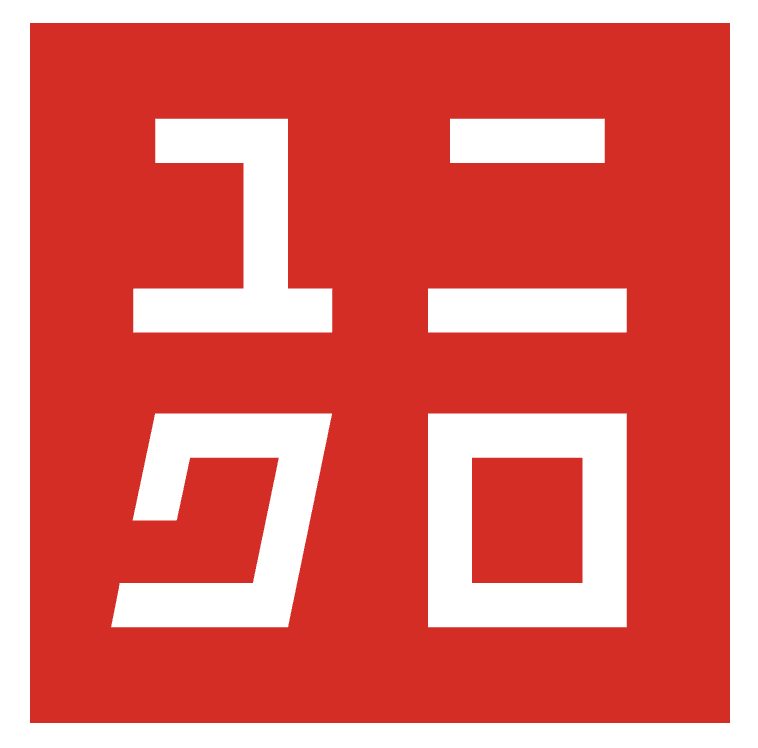
Uniqlo’s logo, a red square with white katakana and Latin text, is stark yet striking. The geometric shape and clean typography convey modern simplicity and accessibility. It pops on storefronts, bags, and tags. Uniqlo’s minimal approach shows how bold shapes and limited colors can create a strong identity.
5. Airbnb: A Symbol of Belonging

Airbnb’s logo, the Bélo, is a single, abstract shape combining a heart, location pin, and letter “A.” Launched in 2014, its fluid lines and soft palette feel warm and inclusive. It works across digital platforms and merchandise. Airbnb’s minimalist symbol proves that simplicity can evoke deep emotional resonance.
Tips for Minimalist Logo Design
Minimalism requires precision to create impact with few elements. Here’s how to nail it:
- Focus on One Idea: Distill your brand’s essence into a single, clear concept.
- Use Simple Shapes: Stick to basic forms—circles, lines, or squares—for versatility.
- Limit Colors: Choose a restrained palette (1-2 colors) for clarity and cohesion.
- Embrace Negative Space: Let empty space enhance your design’s impact.
- Ensure Scalability: Test your logo at all sizes to confirm it remains sharp.
Conclusion
Minimalist logos prove that simplicity is a superpower in branding. At Worldvectorlogo, we’re inspired by designs that achieve maximum impact with minimal elements. Let Apple, Nike, Google, Uniqlo, and Airbnb guide you to create logos that are bold yet understated. Visit Worldvectorlogo.com to explore our vector logo resources and start designing with less!
