In the decentralized universe of cryptocurrencies, where code meets culture, a single logo can become a global emblem of financial revolution. These aren’t just pretty pictures—they’re shorthand for trust, innovation, and sometimes even memes that propel billion-dollar ecosystems. Let’s spotlight the top 5 most iconic cryptocurrency logos. We’ll break down their design genius, symbolic power, and why they’ve etched themselves into our digital psyches.
Whether you’re a seasoned HODLer or a curious newcomer, these logos have likely crossed your screen more times than you can count. Curious about their real-time performance? We’ve got direct links to their pages on Coinranking, the go-to hub for live prices, charts, and rankings. Let’s decode the icons.
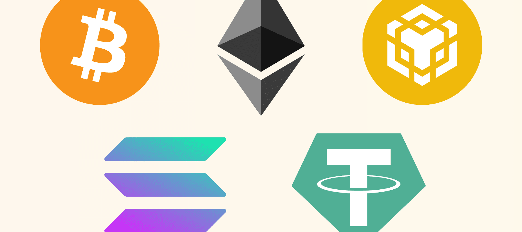
1. Bitcoin (BTC): The Original “₿” – Simplicity Meets Sovereignty
(Vector available for download on Worldvectorlogo)
Ah, the Bitcoin logo—the undisputed king of crypto iconography. Debuting in 2010, this sleek orange “B” slashed by two vertical lines evokes a coin tumbling through a digital ether, symbolizing peer-to-peer electronic cash. Its minimalist design draws from the British Pound symbol (£), nodding to Bitcoin’s roots as a fiat challenger, while the orange hue screams “digital gold.”
Why it stands out: In a sea of cluttered designs, Bitcoin’s logo is pure elegance. It’s instantly recognizable at thumbnail size, scalable for everything from wallet apps to protest signs, and carries the weight of a $1 trillion+ market cap. No wonder it’s the blueprint for every crypto brand since.
Explore Bitcoin’s live chart and stats on Coinranking.
2. Ethereum (ETH): The Ethereal Diamond – Gateway to Infinite Possibilities
(Vector available for download on Worldvectorlogo)
Ethereum’s logo is a geometric masterpiece: a jagged, interlocking diamond in grayscale, resembling a crystal lattice or a portal to the blockchain’s smart contract multiverse. Introduced in 2014 by Vitalik Buterin and team, it captures the platform’s essence as a programmable world computer.
Why it stands out: The asymmetry and sharp edges convey motion and complexity—perfect for a network powering DeFi, NFTs, and dApps. Its monochromatic palette keeps it versatile and futuristic, avoiding the “flashy” trap of competitors. With Ethereum’s upgrades making it faster than ever, this logo feels like a timeless rune.
Dive into Ethereum’s price action on Coinranking.
3. Tether (USDT): The Stable Anchor – Reliability in a Stormy Sea
(Vector available for download on Worldvectorlogo)
Tether’s logo is deceptively simple: a bold “T” intertwined with a dollar sign ($), rendered in a clean blue that echoes trust and stability. Launched in 2014, it represents the world’s largest stablecoin, pegged 1:1 to the USD.
Why it stands out: In crypto’s volatility circus, Tether’s design is a breath of calm—functional, unpretentious, and screaming “safe harbor.” The $ integration is a genius stroke, bridging fiat familiarity with blockchain utility. With over $100 billion in circulation, it’s the liquidity lifeline for traders worldwide, and its logo’s no-nonsense vibe mirrors that reliability.
Track Tether’s real-time price on Coinranking.
4. Binance Coin (BNB): The Yellow Beacon – Powering an Empire
(Vector available for download on Worldvectorlogo)
BNB’s logo features a stylized yellow “B” with orbiting dots, evoking a buzzing exchange hub or a cosmic trade node. Born in 2017 alongside the Binance empire, it started as an ICO token and evolved into the fuel for the BNB Chain.
Why it stands out: That vibrant yellow pops like a spotlight in the crypto night sky, symbolizing speed, growth, and accessibility. The dynamic dots hint at Binance’s vast ecosystem—trades, NFTs, and beyond—while keeping the design modern and energetic. As BNB powers fee discounts and DeFi on its chain, this logo has become synonymous with scale.
Check BNB’s live price on Coinranking.
5. Solana (SOL): The Purple Velocity – Speed in Stylish Strokes
(Vector available for download on Worldvectorlogo)
Solana’s emblem is a sleek, purple wave-like “S” that flows like data packets racing across a high-speed network. Unveiled in 2020, it embodies the blockchain’s promise of 65,000 TPS without the gas fee drama.
Why it stands out: The fluid, aerodynamic form captures Solana’s “proof-of-history” edge—fast, efficient, and forward-leaning. Purple adds a layer of innovation and exclusivity, setting it apart from the orange-and-gray crowd. With Solana’s meme coin frenzy and real-world apps booming, this logo rides the wave of tomorrow’s web3.
Monitor Solana’s price performance on Coinranking.
Why These Logos Matter in Crypto’s Visual Revolution
These five logos aren’t random picks—they’re the visual vanguard of a $2 trillion industry, blending symbolism, scalability, and storytelling to build unbreakable brand loyalty. From Bitcoin’s foundational gravitas to Solana’s sleek velocity, each one distills complex tech into memorable marks that drive adoption.
But the crypto canvas is vast, with thousands more coins waiting to spark your interest. Whether you’re hunting undervalued gems or tracking blue-chips, head over to Coinranking.com right now. It’s your one-stop dashboard for real-time prices, in-depth charts, and the full spectrum of digital assets. What logo catches your eye next? Drop a comment below—we’d love to hear!
This article is brought to you by Coinranking, empowering traders with transparent, real-time crypto insights. All opinions are our own, based on design trends as of 2025.