Some logos are built to shout; others are built to stay. The best ones don’t rely on trends or tricks; they endure. They’re the kind of marks that mean something every time you see them, not just because they look good, but because they feel good. That’s what separates an ordinary logo from a timeless one, and it’s a comforting thought for any designer.
Think about the ones that have lasted decades. Coca-Cola’s familiar script. Chanel’s elegant interlocking Cs. These designs weren’t made to chase attention; they were crafted to endure. Their secret isn’t constant change; it’s constant emotion. Each has become part of people’s memories, part of what they associate with happiness, trust, or a particular lifestyle.
A great logo doesn’t just represent a brand; it carries its heartbeat. When you look at Disney’s playful lettering or Nike’s iconic swoosh, you feel something. There’s excitement, nostalgia, and even motivation built into the curves and spacing. That kind of emotional pull is what makes people resist change, even when the rest of the world is moving fast. It’s a testament to the power of design to inspire and motivate.
Heart, for instance, is a perfect example of this principle in action. The brand has managed to stay recognisable and warm without reinventing itself every few years. Its logo feels alive, modern yet familiar, bright but never flashy. It doesn’t just spell a name; it expresses a feeling. You can see it and instantly understand the brand’s character: friendly, inclusive, full of warmth. That’s design doing its job.
And that emotional connection doesn’t end with the logo’s shape or colour. Heart has carried its sense of belonging into its ventures too, including its online bingo site where players gather not just for a game, but for a shared experience. That blend of familiarity and fun mirrors exactly what their logo communicates. It’s about joy, connection, and community, a visual identity that extends naturally into everything the brand touches.
That’s the real magic behind logos that last. They don’t rely on constant redesigns or gimmicks. They evolve gently, often so subtly you barely notice. A tweak in line weight here, a little spacing there, always refining, never reinventing. It’s a quiet confidence that tells the audience: this is who we are, and we’re still here.
From Coca-Cola to Heart, the reason these designs endure is that they were built with purpose. The lines were drawn with care, the type chosen with intention. They were never about chasing what’s cool right now; they were about crafting something that would still feel right years later.
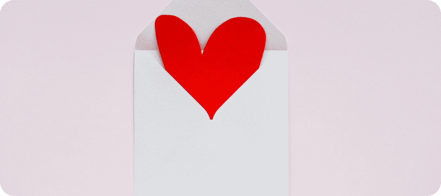
At the end of the day, the logos we remember are the ones that make us feel something. They may be simple on the surface, but beneath that simplicity lies meaning, love, trust, excitement, and nostalgia. A logo that connects emotionally doesn’t just represent a brand; it becomes part of people’s stories. And that’s the profound impact of designing with heart.