Fitness branding is evolving. As the industry matures, its visual expression grows too. In 2026, fitness logos are no longer focused on striking graphics or overly complex visuals. Instead, brands are prioritizing clarity, meaning, and versatility.
This shift reflects a broader change in the fitness industry itself. Fitness today is not only about intense training or extreme results—it is also about balance, lifestyle, and sustainability. Branding has naturally evolved alongside this mindset.
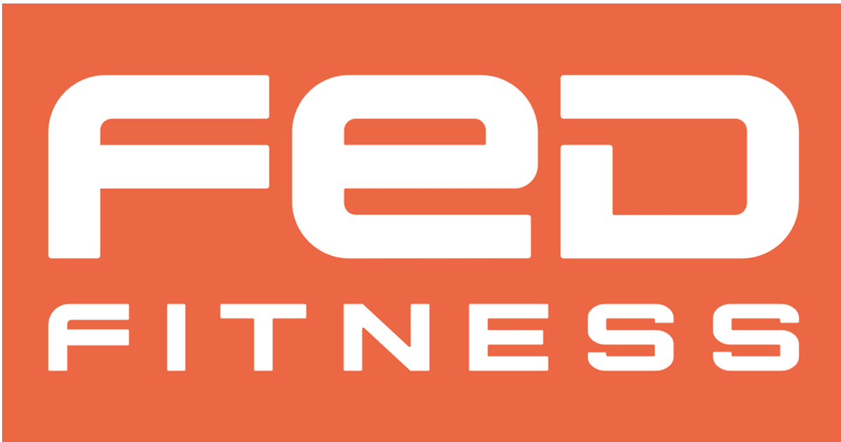
Clean Logo Design That Communicates Through Simplicity
One of the strongest trends in modern fitness branding is minimalism. Instead of using detailed illustrations or heavy icons, brands now rely on spacing, proportions, and clean structure to create identity.
Minimalist logos help brands like FED Fitness maintain a modern and adaptable visual presence across different platforms.
Clean design is especially important in the digital age. Logos must work smoothly on mobile screens, websites, apps, and product packaging. A simple and well-structured logo avoids the need for frequent redesigns and remains effective for years.
Typography as the Core of Fitness Identity
Typography has become a central element in fitness logo design. In many modern cases, the brand name itself becomes the main visual identity instead of a symbol.
This approach gives brands more flexibility, allowing them to adjust font style, spacing, and weight depending on the audience and platform.
Strong typography also builds recognition quickly, which is important in a competitive fitness market.
Movement Without Motion: Visual Flow in Design

Although logos are static, modern design techniques create the illusion of movement. This is achieved through angled lines, directional shapes, and dynamic spacing that suggest progress and energy. This design style reflects the core idea of fitness—constant improvement and forward motion.
Even in product-related branding or equipment presentation, such as showcasing tools like the BCAN soft land pro rebounder, this sense of movement helps communicate energy and activity without needing animation.
Color Psychology in Modern Fitness Branding
Modern fitness logos are shifting toward neutral and balanced color palettes. Instead of overly bright or aggressive tones, designers now prefer black, white, grey, and subtle contrasts.
This approach improves versatility and ensures that the logo works across multiple platforms, from websites to packaging and digital ads.
Rather than relying on loud visuals, the focus is now on structure and long-term brand consistency.
Geometry and Structure That Builds Trust
Another important element in fitness logo design is geometry. Clean shapes, alignment, and balanced proportions create a sense of stability and professionalism.
This structure is important because it visually represents discipline, strength, and control—qualities that are directly associated with fitness itself.
A well-structured logo not only looks professional but also builds trust among audiences.
From Performance Branding to Lifestyle Identity
Fitness branding has shifted from pure performance messaging to a broader lifestyle concept. Instead of focusing only on strength and intensity, modern brands now emphasize health, balance, and everyday wellness.
This change makes fitness brands more approachable, especially for beginners or casual users who are not focused on extreme training goals.
As a result, logos are becoming softer in tone while still maintaining a strong and professional identity.
Conclusion
The most successful fitness logo styles in 2026 are built on simplicity, clarity, and adaptability. Minimal design, strong typography, balanced color usage, and structured geometry define the modern visual identity of fitness brands.
Instead of following temporary trends, designers are focusing on timeless principles that allow logos to remain relevant across changing digital platforms. In a fast-evolving industry, simplicity and consistency have become the strongest branding tools.
FAQs
How can a fitness logo be modern in 2026?
A modern fitness logo uses clean design, strong typography, and balanced structure. It avoids unnecessary complexity and works well across digital platforms.
Do fitness companies need to update their logos frequently?
Not necessarily. If a logo is well-designed, minimal, and versatile, it can remain effective for many years without major changes.
Why does a minimalist logo work better today?
Minimalist logos are easier to recognize, more scalable, and perform better across mobile apps, websites, and branding materials.