A licensed logo reaches a game studio as a rulebook before it arrives as artwork. There are pages on clear space and colour values, and usually a longer section on what must never be done to the mark. The artwork itself is often the smallest file in the folder. Licensing is a $389.8 billion retail business by Licensing International’s latest count, with character and entertainment brands making up $161.8 billion of that in 2025. Casino games are a small, specialised corner of it. They’re a demanding corner for designers, though, because a logo that normally sits still on a mug or a T-shirt has to move.
Where the template came from
The model goes back to the 1990s. IGT released its Wheel of Fortune slot in 1996 under licence from Sony, owner of the TV format, and still describes it as the industry’s first licensed slot. The spinning bonus wheel that later sat on top of the cabinet was a separate piece of intellectual property, patented by Anchor Gaming and licensed in.
The basic arrangement hasn’t changed much since. The studio signs with the rights holder, and a PDF of brand standards lands in the art team’s inbox.
Questions the guide never expected
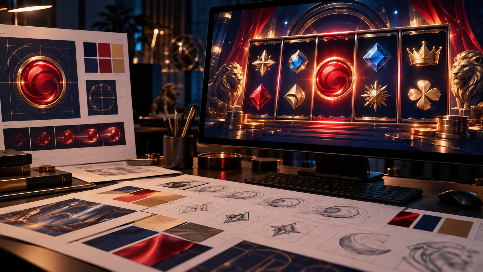
Most of those standards were written for print and packaging, long before brands adapted their assets for casino slots games online, and they rarely include guidelines for motion or responsive UI.Scale comes up first. The same mark has to work as a thumbnail on a tile no bigger than an app icon, as a full-width title card when the game loads, and as a small watermark while the reels are running. Most big brands already keep stacked, horizontal and icon-only versions, the kind of variants iconic logos rely on as they evolve, and a game tends to need all of them at once. Clear-space rules and minimum sizes are harder to honour on a tile a couple of centimetres wide.
Motion is the next problem. Many identity manuals include a page of forbidden treatments, don’t stretch it and don’t recolour it among them, and designers of branded games can spend a good while negotiating how much a mark may bounce or glow before it breaks the letter of the manual. Rights holders are protective even of marks they’ve stopped using. NASA’s brand guidelines spell out that its insignia and logotype aren’t in the public domain and can’t be used without permission, and its red “worm” wordmark, designed by Richard Danne and Bruce Blackburn in 1975, was retired in 1992 and only allowed back, alongside the older meatball insignia, in 2020.
What licensors send back
Licensors watch colour closely. One build with a new background or a new character pose can sail through approval, and the next can come back because a brand red has drifted on a phone screen, where colour profiles vary from one handset to another. Fonts are the other regular sticking point. A custom brand typeface is often licensed for print and web but not for embedding in software, so a studio can end up with a logo it’s allowed to use and a font it isn’t. The usual fix is a plain sans serif for the menus and paytable, with the brand typeface kept to the logo itself.
Sound logos are a newer headache. THX’s Deep Note debuted at the premiere of Return of the Jedi in 1983, and Andy Moorer, the Lucasfilm engineer who created it, refreshed it in 2015. In the UK, the rule that a trade mark had to be represented graphically was dropped on 14 January 2019, which made it simpler to register a sound as a mark. A theme tune was always protected by copyright; a registered sound mark adds trade mark rules on top, so a studio can find itself with two sets of conditions on the same few seconds of audio.
Designers still point to Massimo Vignelli and Bob Noorda’s graphics standards manual for the New York City Transit Authority as proof that a system can flex without falling apart, and a slot title card is a fair test of that. The original is now in MoMA’s collection.