In a crowded digital marketplace, first impressions are rarely accidental. Before a user reads a review, explores a feature set, or even understands the rules of a game, they encounter a logo. At that moment, a decision is already forming. For novice players especially, a logo acts as a kind of visual handshake. It signals whether a platform feels trustworthy, modern, and worth exploring, or chaotic and potentially unreliable.
This is where design moves beyond aesthetics and into psychology.
The Semiotics of Trust
At its core, a logo is a system of signs. Through shape, typography, and color, it communicates meaning instantly. For new users navigating unfamiliar gaming environments, these signals carry even more weight.
A clean, well-structured vector logo suggests professionalism and stability. Sharp lines, balanced proportions, and consistent spacing create a sense of order. In contrast, overly complex or cluttered designs can introduce friction. They require effort to interpret and can subconsciously signal unpredictability.
From a semiotic perspective, simplicity often correlates with trust. Minimalist logos reduce cognitive load, allowing users to process information quickly and move forward with confidence. This is particularly important for novice players who may already feel overwhelmed by choice.
Vector-based design also plays a critical role here. Scalable assets ensure that logos remain crisp across devices, from high-resolution desktop displays to smaller mobile screens. This consistency reinforces brand reliability at every touchpoint.
Color Theory and Risk Perception
Color is another powerful driver of perception. Traditional gaming platforms often leaned heavily on neon palettes and high-contrast visuals designed to capture attention. While effective in certain contexts, this approach can feel overwhelming to new users.
In contrast, the shift toward darker, more restrained palettes reflects a broader design evolution. Deep blues, blacks, and whites are increasingly associated with authority and control. These colors are commonly used in finance, technology, and other industries where trust is paramount.
For a novice player, this matters. A platform that visually aligns with established, professional industries feels safer to engage with. The design reduces perceived risk before any interaction takes place.
From Logo to Interface: The Importance of Visual Continuity
A logo alone does not make a good UI. Taking a clean and modern logo and plopping it on top of an old and inconsistent design is bad. Taking a clean and modern logo and then having a bunch of old and inconsistent games does not make for a good gaming experience. It will take you right out of the experience.
A good design system will ensure consistency in the visual language of the product. This includes typography, iconography and other design elements that complement the logo design. Ideally, all design elements should be connected through the visual identity established with the logo design.
The visual hierarchy is critical for new users. A page that is well-structured and knows how to direct the users’ focus will help them to understand how to use the application. An easy to use interface means an easier first time using it.
The Novice Factor: Lowering Cognitive Barriers
For experienced players, design may be secondary to functionality. But for newcomers, it is often the deciding factor. Clean typography, balanced iconography, and intuitive layouts create a sense of control. The platform feels less like a chaotic arcade and more like a structured, reliable environment. This shift is subtle but significant.
When a design system reduces cognitive friction, users are more likely to engage. They feel confident in their ability to understand the interface, which makes the first interaction less intimidating. This is where brand consistency becomes critical.
A Case Study in Cohesion
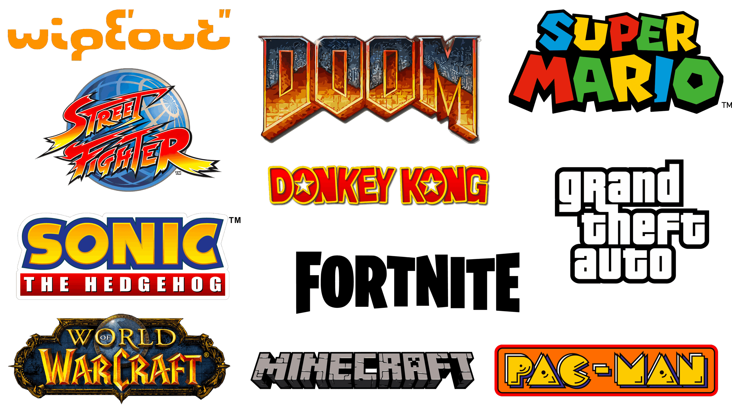
(i) Video Game Logos: Identity Through Immersion
In the video game industry, logos are rarely just identifiers. They are extensions of the game world itself. From bold, stylised typography in action titles to minimal, atmospheric marks in indie games, logos are designed to signal tone, genre, and experience at a glance.
Importantly, these logos are rarely isolated elements. They are supported by cohesive visual systems – menus, icons, loading screens – all reinforcing the same identity. This consistency helps players quickly understand what kind of experience they are stepping into, reducing uncertainty and building immediate familiarity.
For new players, this clarity matters. A strong, consistent visual identity lowers the barrier to entry and encourages exploration.
(ii) Casino Game Logos: Clarity Over Complexity
Casino platforms operate in a slightly different context, where trust and usability are just as important as visual appeal.
Here, logos tend to prioritise clarity, balance, and recognisability. Clean typography, controlled colour palettes, and scalable vector design ensure that branding remains consistent across devices and screen sizes. Rather than overwhelming the user, the goal is to create a stable visual anchor within a content-rich environment.
This is particularly important given the volume of options typically available. A cohesive visual identity helps organise that complexity, allowing users to navigate with confidence rather than hesitation.
On platforms like the Betway online casino, for example, the visual identity established by the logo carries through into the broader user experience. Structured layouts, consistent typography, and high-quality visuals all reinforce the same design logic, creating a unified environment that feels considered rather than fragmented.
This alignment contributes to what designers often describe as a “halo effect,” where the perceived quality of the visual design influences how users interpret the platform as a whole. For a first-time visitor, that sense of cohesion can quietly shape the decision to engage.
The First Click as a Design Outcome
It is improbable that a purchase decision will be based on a single attribute. A variety of attributes along with the design of a product will influence the decision. Graphics, color schemes and design of the user interface affect the player’s sense of security and usability. For the inexperienced player, these are not just decorations, but also means to support their decision-making process.
The first click is not down to chance. The first click is a result of a User Experience that is clear, stable and intentioned enough to elicit the action. And these will be crucial to digital design. Our world is one of choice and the easier the choice is for the user, the less they have to think about what they have to do.