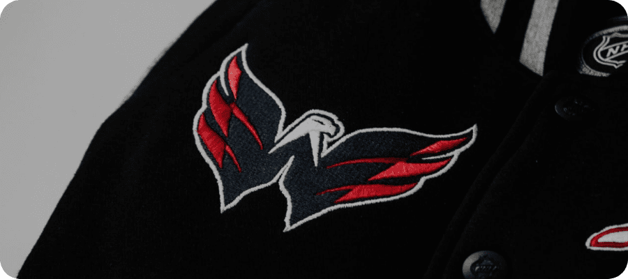
It makes an all-important first impression and will also be the one everlasting aspect of a sports team or club. Whether you call it a logo, a badge, or a crest, depending on the sport and where you are in the world, it is the one thing that makes a team stand out from the rest. The logo will be there long after the latest star athlete has gone – or it should be, at least.
Some of the most well-known team logos have become iconic and even transcend the team and sport they represent. Not everyone around the world wearing a Yankees hat knows that it is the logo of a baseball team – or even like the team. It has become something much bigger than that and such widespread recognition is what any designer should hope for.
Not every sports team wins multiple championships and features on all the best sportsbooks online, of course. But the basic ideas behind what makes a good sports logo remain the same. Here are some key factors to keep in mind.
Keep it Simple
Take a look at any of the original logos across a variety of sports and one thing will be very noticeable. If the team has any kind of history, those first logos were pencil-drawn cartoons or city coats of arms. The idea that a logo should be simple was not part of the planning stage – because, most times, there was no planning stage.
A more straightforward design is going to be far more versatile and fit in with how sports teams use their logos in the modern world. Simplicity also offers a timeless touch. If you are not pandering to the trends of the day or being overly elaborate, your logo should be able to be around for a very long time.
Color Palette
These days, sports teams are very keen on explaining the ideas behind a logo design. Sometimes it feels as though these explainers have been added after the fact and are usually associated with poor logos. The color of the logo has usually been decided by the color of the team’s jerseys – but there is still room to be creative.
A color palette allows designers to use complementary colors, even when they may not be used in the team’s uniforms. It is also a good starting point for how the logo should look. The color scheme should be appropriate, but different colors evoke different emotions and can stand for something more than the team itself.
Consider Adaptability
One aspect of sports team logo design that was very absent in the early days was the consideration of adaptability. In the modern world, being able to use a logo in a variety of ways – and in alternative colorways – is hugely important to not only brand recognition but also for merchandise and apparel sales.
This is where a logo becomes a major branding tool for a sports team. Many teams even have alternative logos these days for that very reason. A good logo should be able to work in any context without losing its original recognition and impact. This is why simplicity is so important to the original design.
Make it Unique
If the team you are designing for is called the Lions, you will need to know that there are hundreds – if not thousands – of other sports teams around the world that either use the word in the name or as a nickname. Originality is going to be difficult here but stamping something as unique is still crucial.
“Lion” designs tend to be very similar but there are still ways that a designer can make a logo unique and instantly recognizable as belonging to just one team. Incorporating local landmarks, such as bridges or buildings, is one way to make the logo stand out. The worst thing a designer can do is come up with a logo that could be universal.
Typography
Some sports leagues, like baseball, have very distinct typography but there is usually more scope in the actual logo. Display fonts are probably the best for single-letter logos – as seen on most baseball caps – but a lot can be done to make sure that the typography has just as strong an impact as the image used.
As with some of the other factors we have already looked at, simplicity is key here. There is no point in using an elaborate font if it is going to be difficult to read it. As much as any image used has to convey the uniqueness of the team, the typography sets the team in a location. Get that wrong and everything else will fail as well.

Figure 2 The best logos are timeless – Source: Pixabay
Think About the Impact it Will Have
Sometimes it might be difficult to make a sports team logo stand out from the crowd, especially if it is for a new team in an already saturated market. However, a designer should not underestimate the impact a good logo can have. Just like the New York Yankees logo we used as an example at the beginning, a good logo can be seen far from the location it represents.
Fans of the team will want to wear the team’s colors and logo with pride – and many even have them forever tattooed on their skin. A logo designer needs to take all of this into account and remember that the logo will always be the first thing people see, as well as an everlasting symbol for many.