By Elle Gellrich
The 1xBet visual identity is built around a short, recognizable wordmark that appears across the brand’s website, mobile interfaces, apps, sports betting pages, and casino sections. Its design is relatively simple, which makes it easy to use in different digital environments and at different screen sizes. Users may encounter the same branding while browsing sportsbook pages, slots, or a live casino online section. The interface may look different across products, but the main brand style usually stays the same. The 1xBet casino logo is part of the wider 1xBet visual identity, not a completely separate casino logo. This article explains its design, colors, and typography. It also looks at where different versions appear and how to tell brand recognition apart from real website or app authenticity.
What Does the 1xBet Logo Look Like?
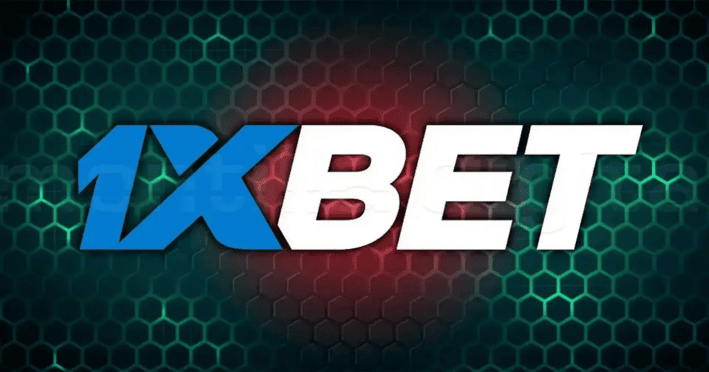
The main 1xBet logo is a wordmark. The brand name is the main part of the logo. There is no separate mascot, crest, or complex symbol. The design combines “1”, “x”, and “Bet” in one horizontal wordmark. Blue and light blue shades help separate the parts of the name. The design is simple and easy to recognize. It also stays readable in menus, apps, ads, and other small digital spaces.
The 1xBet Wordmark
A wordmark is a logo that mainly uses the brand name. Many well-known brands use custom lettering instead of a separate symbol. The 1xBet logo follows this style. The name itself is the main visual element. This makes the logo easy to recognize even without extra casino, betting, or sports images. A short brand name also works well in small spaces. It can fit into a mobile header without losing its identity.
Main Colors
The logo mainly uses blue colors. Some parts of the wordmark are darker, while others are lighter. This creates contrast but keeps the design consistent. The exact shades may look slightly different depending on the background, screen, image quality, or logo version. Blue is common in digital branding because it works well on both light and dark backgrounds. However, these general ideas should not be treated as the company’s official reason for choosing blue unless the brand has said so.
Typography and Letter Shapes
The lettering is bold and compact, so the logo stays easy to read at small sizes. The number, lowercase “x,” and the word “Bet” create a clear and recognizable design. The logo is short enough for website headers, app icons, and mobile menus. It also avoids too much detail, which helps it stay readable when reduced in size.
Is the Casino Logo Different From the Main 1xBet Logo?
The casino section is part of the wider 1xBet platform, not a separate brand. Users may see the same main logo in both the sports betting and casino sections. The main differences are usually in the design around it. These can include game images, casino categories, backgrounds, banners, and navigation labels.
Logo on Casino Pages
Casino pages often use colorful slot images, live-dealer tables, provider logos, and category icons. This can make them look different from sportsbook pages. However, the main platform branding usually stays the same. Individual games may also have their own logos. For example, a slot can show the developer’s logo inside the game, while the page around it still shows the 1xBet wordmark.
Logo on Sports Betting Pages
Sportsbook pages usually focus on leagues, matches, odds, teams, and events. This makes the interface look more data-focused than a casino section. The main logo can still stay the same. This helps keep the platform consistent, even when different sections use very different layouts.
Why the Same Branding Is Used Across Sections
Using one main visual style helps users see that all product sections belong to the same platform. A different logo for every section could be confusing. Keeping the main wordmark the same makes it easier to move between sportsbook, casino, live games, and other areas. Users still recognize the parent brand. This approach is common on large digital platforms that offer several services under one name.
What Does the 1xBet Logo Mean?
The logo is built around the brand name, not a complex symbol. It does not clearly represent one specific idea. Because of this, it is better to describe its design and visual style instead of guessing what each character might mean.
Meaning of “1xBet”
The characters simply form the brand name. There is no clear reason to give separate meanings to the number 1, the letter x, or the word Bet unless the company has explained them publicly. From a design point of view, the name works well because it is short, easy to recognize, and clearly linked to betting.
Why the Design Is Simple
Simple logos are easier to reproduce across many formats. A compact wordmark works well in many places, such as desktop headers, mobile screens, apps, ads, sponsorship graphics, and social media. It usually does not need major changes for each format. A simple logo also works better next to other brands. Complex logos can lose detail when made smaller, while short text often stays clear and easy to read.
What the Blue Color Communicates
Blue is widely used in digital products and technology-focused branding. It can provide strong contrast, particularly against white, gray, or dark backgrounds. It also tends to remain recognizable across different screen sizes. These are general design advantages rather than proof of a specific symbolic intention behind the 1xBet color palette.
Where the 1xBet Brand Mark Appears
The logo can appear in many places. Users may see it on the main website, in mobile apps, on casino pages, or in sports promotions.
Official Website
The website header is one of the easiest places to find the full logo. It shows users which platform they are viewing and often links back to the homepage. The page content may change, but the main logo usually stays in the same place. This makes it an important part of both navigation and brand identity.
Mobile Website and Apps
Mobile screens have less space than desktop screens, so logos may appear in a simpler form. The full wordmark can still be used, but smaller areas may show a cropped logo, simple symbol, or square icon. However, similar colors or letters do not prove that an app is official. A logo should not be the only thing used to verify an application.
Casino Game Interface
Casino games can show several different logos. The platform may use the 1xBet logo, while each game can show the logo of its developer. Live games may also display the name of the provider or studio. This means the logo inside the game window may be different from the main platform logo.
Sports Sponsorships and Advertising
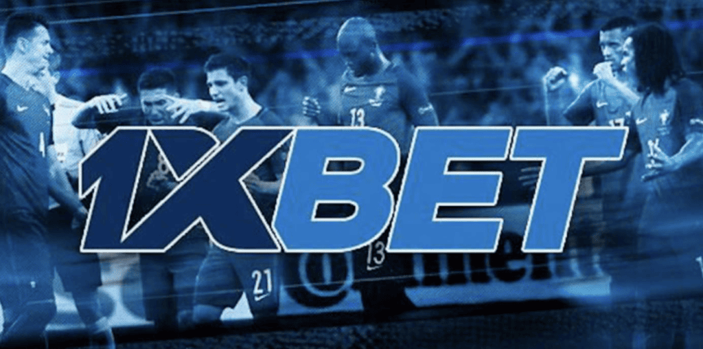
Brand marks are also designed to work outside websites and apps. The same logo can appear on banners, event graphics, sports partnerships, and other ads. These formats may use different backgrounds and layouts. The logo can be adjusted to stay clear and easy to recognize while keeping the same brand identity.
Full Logo vs App Icon vs Favicon
Not every visual representation of a brand is the same type of asset. A full logo, app icon, and browser favicon serve different purposes.
Full Wordmark
The full wordmark is the clearest version of the visual identity. It usually shows the full brand name. This makes it a good choice for website headers, large graphics, and wide layouts. Since the full name is visible, it is also easier to recognize than a small icon.
App Icon
An app icon must fit into a square or rounded-square space. A horizontal logo may not fit well inside a small app icon. For this reason, a brand may simplify, crop, or rearrange parts of the logo. The app icon does not need to be a smaller copy of the full logo. It can be a simpler version that keeps the same brand identity.
Browser Favicon
A favicon is the small icon displayed in a browser tab or bookmark. Because it is extremely small, it cannot usually contain a detailed horizontal logo. Favicons therefore tend to use a simplified symbol, character, or graphic element. They should be treated as supporting brand assets rather than complete replacements for the main logo.
How the Logo Works on Different Backgrounds
A digital logo must remain visible across many environments. The same design may appear on light pages, dark interfaces, photographs, banners, or app screens.
Logo on Dark Backgrounds
Dark backgrounds require enough contrast for the lettering to remain readable. Lighter blue or white elements can become more prominent in these situations. The goal is to keep the main shapes visible without allowing the surrounding design to overpower the logo.
Logo on Light Backgrounds
On white or pale backgrounds, darker blue elements can provide stronger definition. The overall logo can remain recognizable as long as the contrast between the text and background is sufficient.
Monochrome and Simplified Versions
Brands may use black-and-white logos for printing, sponsorship boards, documents, or designs where full color does not work well. A simpler logo may also be used in very small spaces. However, not every modified or black-and-white logo found online is an official brand version.
How to Recognize an Official 1xBet Logo
A logo can help users recognize a brand, but it does not prove that a website is official. Logos and other brand images are easy to copy. A fake or misleading website can use a real-looking logo without having any connection to the company.
Check the Wordmark Carefully
Obvious visual errors can still be useful warning signs. Wrong spelling, odd shapes, strange spacing, distorted letters, or unusual colors can be signs of a poorly copied logo. However, even a perfect logo does not prove that a website is legitimate.
A Correct Logo Does Not Prove a Site Is Official
Anyone can copy an image from a public website. This means a fake or unofficial page can still show the correct brand logo. A familiar logo does not prove that a website is genuine. Brand recognition should be only one small part of the verification process.
Verify the Website or App Separately
A domain should be checked on its own and not judged only by how it looks. The same is true for apps. Check where the installation file comes from, who the developer is, what legal details are provided, and whether the service has a valid local license. Contact and company details should also be compared with trusted official sources when you need to confirm that a website or app is genuine.
Common Variations and Incorrect Versions of the Logo

Users may encounter many modified versions of the brand mark online. Some changes are harmless formatting differences, while others can make a logo misleading or inaccurate.
Stretched or Distorted Logos
A logo can look incorrect when its width or height is changed without preserving the original proportions. This often happens when an image is forced into a fixed-size container. The result can make letters appear unnaturally wide, narrow, tall, or compressed.
Incorrect Colors
Screenshots, compressed images, banners, and third-party graphics may show colors differently from the original logo. Some websites may also change logo colors to match their own design. Because of this, a color difference does not always mean the asset is fake. However, it can be a sign that the file is not an original brand asset.
Added Casino Symbols
Third-party graphics may combine the logo with roulette wheels, cards, slot reels, poker chips, or the word “Casino.” These elements can be useful in article images, but they may not be part of the official logo. A casino-themed brand graphic and the official wordmark can be different.
Low-Resolution Copies
Pixelated edges and blurry text often mean the image was enlarged from a small file or compressed too much. Transparent images can also get unwanted borders or marks if they are converted incorrectly. These problems can make the logo look different, even when the original design has not changed.
Logo, Brand Name and Trademark: What Is the Difference?
These terms are often used interchangeably, but they describe different things.
Logo
A logo is the graphic presentation of a brand. It may consist of text, a symbol, or a combination of both. In this case, the recognizable wordmark is the main visual element.
Brand Name
The brand name exists independently of a specific graphic design. “1xBet” can be written as plain text without reproducing the exact typography or colors of the logo. This distinction matters because a company can change its visual identity while keeping the same brand name.
Trademark
A trademark helps identify the source of a product or service. It can be a name, logo, symbol, or another unique element. Trademark protection depends on local laws and registration status. The rules are different in each country, so general information about trademarks should not be treated as legal advice.
Can You Use the 1xBet Logo on a Website?
Using another company’s logo can involve both practical and legal considerations. The context matters.
Editorial and Informational Use
Logos are often used in news, reviews, comparisons, and informational articles about a brand. The legal rules depend on the country and how the logo is used. An informational page should also make it clear that it is not the brand’s official website.
Commercial Use
Commercial use can raise more complicated questions. Using another brand’s name or identity in ads, products, merchandise, or promotions may require permission. The risk is higher if the use makes people think there is an official partnership or endorsement when there is not.
Avoid Implying Official Affiliation
A third-party website should make its independent status clear. Copying the full look of an official platform can confuse users. This includes the logo, colors, buttons, and page layout. Even without saying the site is official, the design may make it look connected to the brand. Editorial content should therefore look clearly different from official brand materials.
Why Logo Consistency Matters for a Global Gambling Brand
Large digital brands need a clear visual identity that works across many countries, languages, products, and devices. A short wordmark can make this easier.
Recognition Across Languages
The interface text may change between English and other languages, but the main brand name can stay the same. This helps users recognize the platform even when menus and descriptions are translated. A short name written in Latin letters is especially easy to use across different languages because it does not need translation.
Recognition Across Desktop and Mobile
Desktop layouts have more space for logos, menus, search, and other controls. Mobile screens have much less room. A compact logo is easier to scale down and helps keep the navigation clean and balanced.
Recognition Across Casino and Sports Products
Sports betting and casino products look very different. One uses odds, tables, matches, and event data. The other may use game covers, animated graphics, live tables, and colorful categories. A consistent logo helps connect these visually different products under one brand identity.
Frequently Asked Questions
- What Does the 1xBet Logo Look Like?
The main logo is a compact wordmark based on the brand name. It commonly uses contrasting blue tones and bold lettering.
- What Colors Are Used in the 1xBet Logo?
Blue and lighter blue tones are strongly associated with the visual identity. Exact shades should be taken from verified official assets when precise reproduction is required.
- Is There a Separate Logo for the Casino Section?
The casino section generally uses the wider 1xBet brand identity rather than a completely separate core logo. Surrounding graphics and labels can differ.
- What Does the 1xBet Symbol Mean?
The main visual mark is based directly on the brand name. Specific symbolic meanings should not be assigned to individual characters unless the company has officially documented them.
- Is the 1xBet App Icon the Same as the Full Logo?
Not necessarily. App icons have limited square space, so they may use a simplified or adapted version of the main identity.
- Why Does the Logo Look Different on Some Websites?
Differences can come from resizing, compression, alternative backgrounds, outdated files, or unofficial modifications.
- How Can I Tell Whether a 1xBet Logo Is Genuine?
Compare the design with verified official sources, but do not rely on appearance alone. Logos can be copied easily.
- Does an Official-Looking Logo Mean a Website Is Legitimate?
No. A visually accurate logo can be reproduced on an unrelated or misleading website. The domain, app source, company information, and legal details should be verified separately.
- Can the 1xBet Logo Be Used on Another Website?
A logo may be used in some informational, editorial, or comparison content. However, trademark rules differ by country and type of use. The logo should not suggest that the content is official or connected to the brand when it is not.
- Where Can Official Brand Information Be Checked?
The safest source is the company’s official website and its published contact or corporate details. Third-party images or graphics may be outdated or incorrect, so they should not be treated as official brand information.
Conclusion
The 1xBet casino logo is part of the wider 1xBet brand rather than a completely separate casino logo. It usually uses a compact wordmark, bold letters, and a blue color scheme. Different versions may appear on websites, mobile apps, casino pages, sportsbook sections, favicons, and sponsorship materials. These versions can look slightly different because they are made for different uses. However, a familiar logo does not prove that a website or app is official. It is still important to check the domain, app source, company details, and other verification information separately.