At Worldvectorlogo, we recognize that global brands need logos that transcend borders, cultures, and languages. A universally appealing logo must be simple, adaptable, and culturally sensitive while maintaining a strong identity. This article explores how global brands design logos that resonate worldwide, highlighting five iconic brands that achieve international recognition through thoughtful design.
The Challenge of Global Logo Design
A global logo must communicate instantly across diverse audiences, avoiding cultural missteps while ensuring versatility for various platforms. It needs to balance uniqueness with universality, making it memorable everywhere. For Worldvectorlogo’s community, designing for global appeal is a key skill. Let’s examine five brands that master this art.
1. Coca-Cola: Universal Refreshment
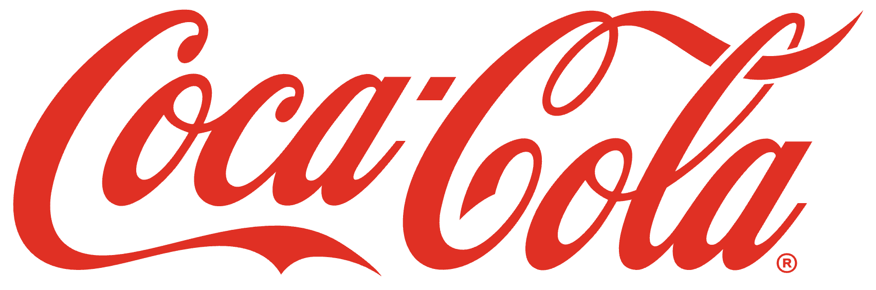
Coca-Cola’s logo, a flowing cursive wordmark, has been a global icon since 1887. Its timeless typography and silver-white palette feel festive and familiar worldwide, shining on bottles and billboards. The design’s simplicity avoids cultural barriers, embodying universal joy. Coca-Cola shows how a classic font can unite the world.
2. Samsung: Tech Simplicity
Samsung’s logo, a sleek sans-serif wordmark in deep blue, radiates innovation and trust. The minimalist design and globally neutral color make it accessible across cultures, thriving on devices and ads. Its clean lines ensure legibility in any language. Samsung proves that simplicity can speak globally.
3. Unilever: Diversity in Unity
Unilever’s logo, a blue “U” composed of 25 icons, reflects its diverse product range and global reach. Each icon symbolizes a value like sustainability or nutrition, resonating universally. It works on packaging and digital platforms. Unilever shows how a symbolic logo can unify a global portfolio.
4. IKEA: Functional Warmth
IKEA’s logo, a bold blue-and-yellow wordmark, mirrors the Swedish flag while feeling approachable worldwide. The sans-serif font and vibrant colors convey functionality and friendliness, popping on stores and catalogs. Its design avoids cultural specificity. IKEA proves that national roots can still feel universal.
5. HSBC: Global Geometry
HSBC’s logo, a red-and-white hexagonal emblem, draws from its Hong Kong origins while feeling modern and neutral. The geometric shape symbolizes stability, working across cultures on ATMs and signage. Its simplicity ensures clarity everywhere. HSBC shows how abstract design can achieve global appeal.
Tips for Global Logo Design
Designing for a global audience requires strategy and sensitivity. Here’s how to succeed:
- Simplify the Design: Use clean shapes and fonts that translate easily across languages.
- Avoid Cultural Pitfalls: Research symbols and colors to ensure they’re appropriate worldwide.
- Choose Neutral Colors: Opt for universal hues like blue or red that carry broad appeal.
- Test Scalability: Ensure the logo works in small sizes and diverse formats globally.
- Engage Local Insights: Gather feedback from international audiences to refine the design.
Conclusion
A global logo bridges cultures, creating a unified brand identity that resonates everywhere. At Worldvectorlogo, we’re inspired by designs that connect the world. Let Coca-Cola, Samsung, Unilever, IKEA, and HSBC guide you to craft logos with universal appeal. Visit Worldvectorlogo.com to explore our vector logo resources and design for a global stage!