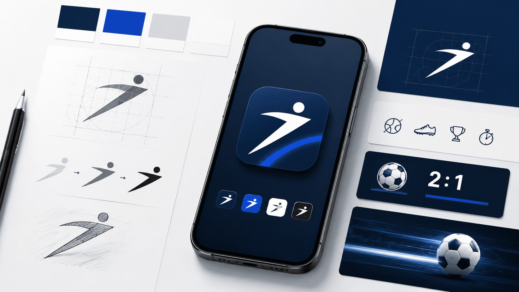
A strong logo is only the starting point of modern brand recognition. Once a brand moves into mobile, its identity has to work in a much smaller, faster, and more interactive environment. That is especially true for sports-related platforms, where users often move between websites, apps, social channels, and live updates in a matter of seconds. For design-focused websites like Worldvectorlogo, this shift matters because logos are no longer judged only on a desktop header or printed material. They are judged on home screens, notification panels, and app store previews. If a brand’s visual language breaks down there, even a well-designed logo can lose impact.
Why mobile branding changes the rules
Mobile interfaces reduce visual space but increase the number of brand touchpoints. A user may first notice an app icon, then a splash screen, then navigation symbols, and only later connect those details back to the main logo. In other words, recognition now depends on a complete system rather than a single mark. That is why major platforms invest in icon clarity, color consistency, and simple shapes that remain legible at very small sizes. Even Apple’s app icon guidelines emphasize that a memorable icon should express the app’s purpose and personality while staying instantly recognizable.

Image: logo design process with smartphone mockup and brand elements
What sports and gaming brands can learn
Sports and gaming platforms operate in highly competitive spaces where fast recognition matters. Users often make split-second decisions based on familiarity and trust, and much of that trust comes from visual consistency. A logo may attract attention, but the mobile experience is what reinforces credibility.
This is where many brands either succeed or fail. Some simply shrink a desktop logo into an app icon and hope it works. Others adapt the brand properly by simplifying details, keeping typography secondary, and making sure colors and symbols still feel connected to the parent identity.
A good example of this broader evaluation process can be seen in resources that examine mobile product presentation, such as the BetNow mobile app. Pages like this are not just about features. They also reflect how users interpret a brand once it moves into a mobile environment, where usability and visual familiarity work together.
The branding lesson behind the screen
For logo designers and brand managers, the takeaway is simple: a logo should never be treated as a standalone asset. It has to function as part of a flexible identity system that works across app icons, interface symbols, loading screens, and promotional graphics.
The best mobile-first brands usually share three traits:
- simple shapes that stay clear at small sizes
- a limited color system that remains recognizable
- visual consistency between website, app, and social media assets
That approach helps users build familiarity faster, whether they are browsing scores, checking updates, or exploring a service on a phone for the first time.
In mobile environments, effective branding depends on more than a well-crafted logo. Designers have to think about scalability, clarity, spacing, color balance, and how visual elements translate across icons, interfaces, and small-screen layouts. The most successful sports brands are those that build a flexible identity system, where every element feels connected and recognizable from the logo itself to the full mobile experience.