


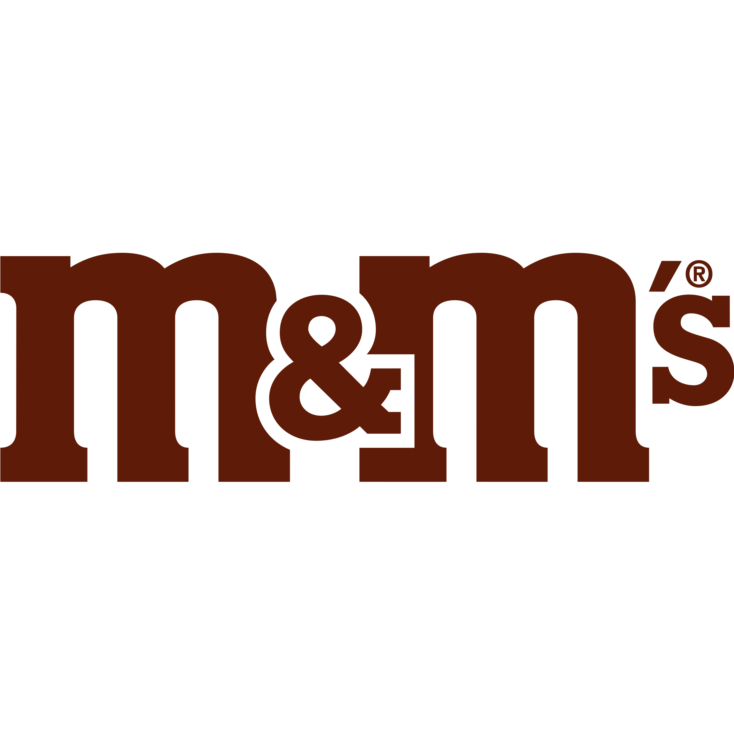
What Is the M&M's Logo?
The M&M's logo is the name m&m's in white lower-case letters with a brown outline, set on a yellow rectangle. The two Ms stand for the surnames of Forrest E. Mars Sr. and Bruce Murrie, who started making the sweets in 1941. M&M's are the sugar-shelled chocolate sweets made by Mars, first produced that year in a factory in Newark, New Jersey.
The name also appears on its own, without the yellow panel, and printed as a single lower-case m on every sweet. The yellow version is available as the M&M's logo SVG.
M&M's Logo Facts
| Introduced | 1941, as a lower-case wordmark |
| Symbol | None; the name forms the mark |
| Logo type | Wordmark: the name in lower-case letters |
| Earlier mark | The printed "m" on each sweet, black from 1950 and white from 1954 |
| Owner | Mars, Incorporated |
What the M&M's Logo Means
The name is a pair of initials, one for each partner. Bruce Murrie, son of the president of Hershey's, held a 20 per cent share in the business. Hershey's chocolate went into the sweets because Hershey's controlled rationed chocolate in the United States during the war, so the logo records a partnership as well as a product.
The lower-case letters tie the logo to the sweets themselves. Since 1950 each one has carried a printed m, the brand's own trademark on the shell, and the logo repeats that small letter at a larger size.
M&M's Logo History
During the Second World War the sweets were sold only to the military. The slogan "melts in your mouth, not in your hand" followed in 1949, and in 1950 a black m was first printed on each piece, turning white in 1954. Black-and-white adverts in 1954 introduced two talking M&M characters, one plain and one peanut.
The wordmark changed many times around them. Its first version, from 1941, was a monochrome lower-case name in a plain sans serif. From 1954 to 1971 it was a hand-drawn yellow wordmark on black, and from 1971 to 1988 a brown name on white. A 1988 version had stronger, cleaner lines and a darker brown, closer to the colour of the sweets.
In 2001 the logo moved to a lighter brown with a brown-and-white outline that gave the letters more volume. From 2004 the name was set on a diagonal, with a brown gradient and black shadow on a white background that followed the outline of the letters. In 2019 the logo became flat and two-dimensional again, keeping the diagonal, with the ampersand outlined in white and raised above the letters.
The colours of the sweets have changed too: in 1995 blue replaced tan after a public vote, with 54 per cent of the votes. In January 2022 Mars announced new designs for its M&M characters, and in September 2022 it introduced a purple one.
For more sweets and snacks, browse our food and drink logos.
Frequently Asked Questions
What do the two Ms in M&M's stand for?
The surnames of Forrest E. Mars Sr. and Bruce Murrie, who started the brand together in 1941.
When was the m first printed on M&M's?
In 1950, in black. It changed to white in 1954.
Where were M&M's first made?
In a factory at 285 Badger Avenue in the Clinton Hill area of Newark, New Jersey, from 1941.
Which M&M's colour was chosen by public vote?
Blue, which replaced tan in 1995 after winning 54 per cent of the votes.