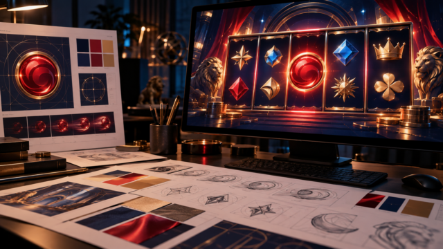
With literally tens of thousands of slots all competing for attention, a new release doesn’t have much time to prove itself. Players load up a game and then spend the rest of the session watching the reels spin. That means the symbols that appear on the reels can do a lot of the selling. They’re what players see on every spin without fail, what they associate wins with, and what they will remember afterwards. A game with generic and forgettable symbols can look like dozens of others, while a distinctive set will give a game an identity and help it stand out from the crowd.
Symbols Bring The Theme To Life
A theme is only really as convincing as the artwork it carries. Viking sagas, jungle expeditions and space adventures all depend on symbols that feel part of the same world, a hallmark of the top casino games online. When the wild, the scatter and the low-value icons share a coherent look, players feel immersed in the action. Mismatched or generic artwork will break that spell in an instant. Players may not consciously notice why a game feels cheap, but they will often drift towards one that feels well crafted.
Readability On The Reels
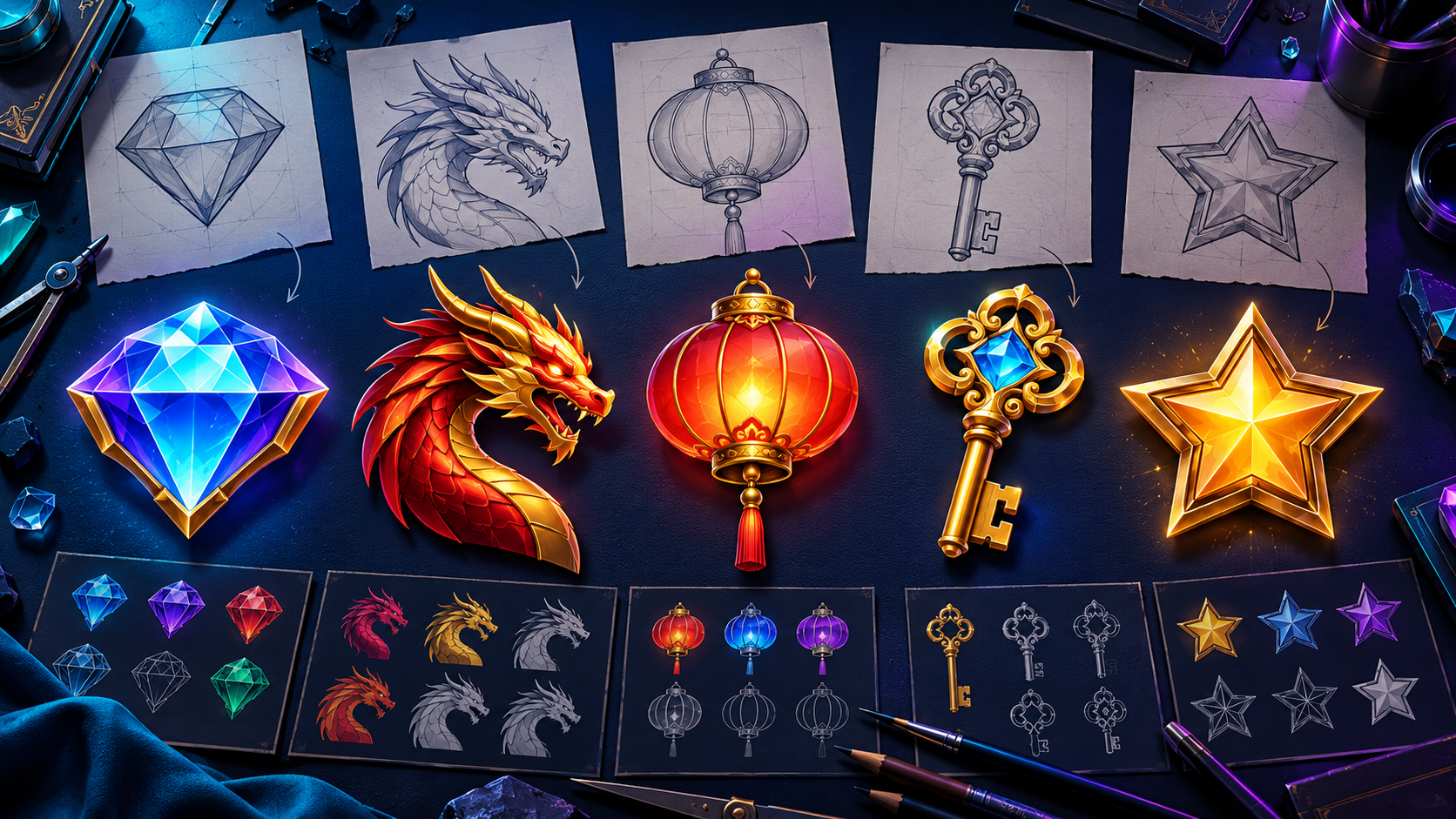
Reels move fast, so symbols must be understood in an instant. A player should be able to tell the difference between a high-paying symbol and a low-paying one without having to spend time thinking about it. Designers will often test this by reducing each symbol to a plain dark shape. If a dragon, lantern and key remain easy to separate, the set will read cleanly during play. If two shapes blur together, players may misjudge a result and feel the game is confusing. Clear silhouettes, strong contrast against the background and a sensible visual hierarchy keep every spin easy to follow.
Colour, Consistency And Mood
A lot of the quiet work is done by colour. Warm golds and reds suggest excitement and reward, while cooler tones feel calmer. Whatever the palette, it should stay consistent across the whole symbol set, as should the drawing style and finish. Artwork that jumps between simple cartoon styles and glossy realism looks unfinished. Colour should never be the only clue either, because players with colour blindness rely on shape to tell symbols apart.
Animation And The Winning Moment
Movement gives symbols a bit of an emotional punch. A winning combination that glows, pulses or bursts into an animation turns a plain payout into a small celebration, and players remember how that felt. Special symbols such as wilds and scatters deserve the strongest visual treatment, since they signal the moments players are waiting for. Restraint matters, though. Too many effects clutter the screen and can make results harder to read.
Conclusion
A strong set of symbols is never going to make up for weak game mechanics or poor bonus features, but it arguably decides whether a slot feels worth playing in the first place. Clear, themed and consistent symbols make spins easier to enjoy and understand, wins easier to celebrate and games easier to remember. In a market where there are thousands of other games, those small pieces of artwork on the reels can often separate a title that gets noticed from one that gets scrolled past.