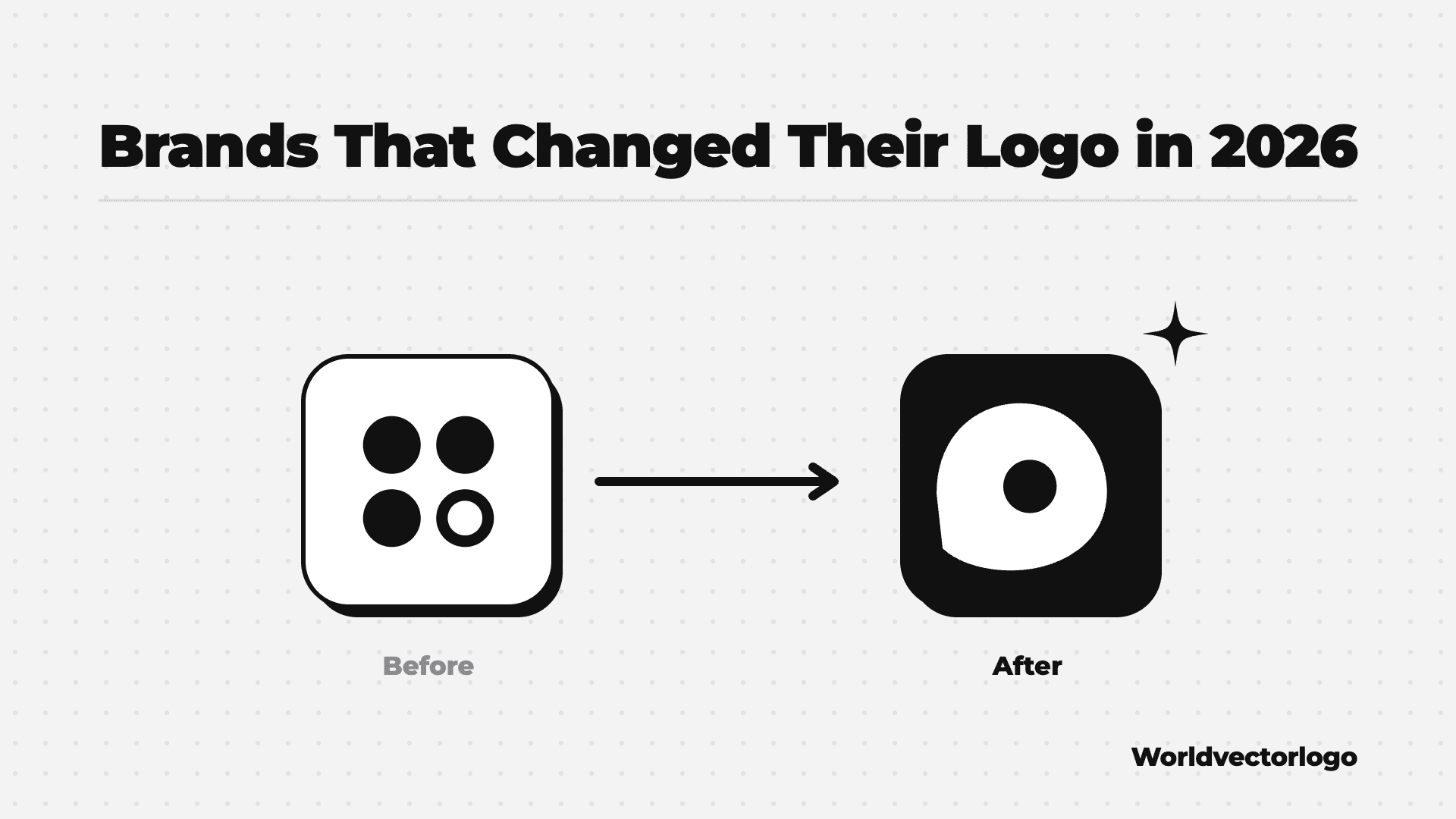
At least 12 well-known brands changed their logo in 2026, by our count of verified announcements. The list includes Instagram, Xbox, KFC, Tinder, McLaren and Apple Music. Many moved to bolder wordmarks. Others brought back older marks, such as the Xbox green and the Harley-Davidson Bar and Shield.
This post is published by Worldvectorlogo. We only list changes we could check in the brand’s own announcement or in a trusted news or design source, on October 31, 2026. Logos are trademarks of their owners and are shown for reference. Our logo pages may show an older version until we add the new file.
2026 Logo Changes at a Glance
| Brand | Month (2026) | What Changed | Source |
|---|---|---|---|
| Harley-Davidson | April | Brought back its historic Bar and Shield logo | Harley-Davidson’s announcement |
| Xbox | April | Dropped “Microsoft Gaming” and went back to a green logo | WBRC report |
| Threads | May | Bolder, italic logo drawn as one line | Social Media Today report |
| Google Workspace | May | New icons for Gmail, Drive, Docs and 11 other apps | Google Workspace Updates blog |
| KFC | June | New 3D bucket logo with a refined Colonel | Design Week report |
| Tinder | July | New all-caps wordmark, type and colors | Transform magazine report |
| August | Bolder, simpler script wordmark | Design at Meta post | |
| Jif | August | Removed the drop shadow, revived the three-color banner | J.M. Smucker press release |
| CD PROJEKT RED | August | Refreshed its raróg bird logo | CD PROJEKT RED press release |
| gFiber | September | New logo, type and colors after dropping “Google” | gFiber press release |
| McLaren | September | New wordmark shared by its racing and car brands | McLaren’s announcement |
| Apple Music | October | Black-and-white logo and icon replace the red | MacRumors report |
1. Harley-Davidson
Harley-Davidson launched a global brand platform called RIDE on April 9. The new visual identity puts the historic Bar and Shield logo back at the center. Source: Harley-Davidson’s announcement. See the Harley-Davidson logo on Worldvectorlogo.
2. Xbox
In late April, Microsoft retired the “Microsoft Gaming” name and went back to Xbox. The black-and-white logo used since 2019 gave way to a bright green, 3D-looking mark. That green has been tied to Xbox since its 2001 launch. Source: WBRC report. See the Xbox logo on Worldvectorlogo.
3. Threads
Threads, the Meta text app, updated its logo and font on May 11. The new mark leans forward in italics and has a heavier weight. It is drawn as one continuous line. The goal is to set Threads apart from Instagram. Source: Social Media Today report. See the Threads logo on Worldvectorlogo.
4. Google Workspace
Google gave 14 Workspace apps new icons, including Gmail, Calendar, Drive, Docs, Sheets and Meet. The aim is to make each app easier to tell apart. The rollout started on May 19. Source: Google Workspace Updates blog. See the Google Workspace logo on Worldvectorlogo.
5. KFC
KFC rebuilt its global identity around its bucket, with the agency JKR. The main logo is now a 3D bucket symbol with a friendlier Colonel Sanders. KFC also added custom typefaces and kept its red, white and black colors. Source: Design Week report. See the KFC logo on Worldvectorlogo.
6. Tinder
Tinder launched a major rebrand in July, made with the studio Porto Rocha. It has a revised uppercase wordmark, new typography and brighter colors. Source: Transform magazine report. See the Tinder logo on Worldvectorlogo.
7. Instagram
Instagram refreshed its brand on August 13. The script wordmark is now bolder and simpler, and the gradient is used more lightly. Instagram also added new typefaces: an updated Instagram Sans, Instagram Pen and Instagram Mono. Source: Design at Meta post. See the Instagram logo on Worldvectorlogo.
8. Jif
Jif peanut butter had its first major brand refresh in more than 30 years, announced on August 10. The logo drops its old drop shadow for a cleaner, bolder look. It brings back an updated version of the three-color banner. Source: J.M. Smucker press release. See the Jif logo on Worldvectorlogo.
9. CD PROJEKT RED
The game studio behind The Witcher and Cyberpunk 2077 refreshed its brand on August 25. Its raróg bird logo was updated to look more mature and confident. Red now sits at the heart of the color palette. Source: CD PROJEKT RED press release. See the CD PROJEKT RED logo on Worldvectorlogo.
10. gFiber
Google Fiber changed its name to GFiber in March. On September 15, it rolled out an updated logo, new typography and a new palette of teal, fuchsia, gold and orange. Source: gFiber press release. We do not have a gFiber logo page yet.
11. McLaren
McLaren announced an evolved identity on September 22. The new wordmark is based on a sign from the Auckland service station run by Bruce McLaren’s parents. One identity now covers both McLaren Racing and McLaren Automotive. Papaya orange stays, and the Speedmark stays too. Source: McLaren’s announcement. See the McLaren logo on Worldvectorlogo.
12. Apple Music
Apple Music has a new black-and-white logo and app icon, with a heavier wordmark. It first showed up in iOS 27.2 beta 3 in early October. Apple confirmed the new identity on October 21 and dropped the red color scheme. Source: MacRumors report. See the Apple Music logo on Worldvectorlogo.
What These Logo Changes Have in Common
- Bolder wordmarks. Instagram, Threads and Apple Music all moved to heavier letters. Bold letters are easier to read at small sizes.
- A return to the past. Xbox brought back its green, Harley-Davidson its Bar and Shield, and McLaren drew on an old family business sign.
- Flatter, cleaner marks. Jif removed its drop shadow. CD PROJEKT RED simplified its colors around red.
- One system for many products. Google redid 14 app icons at once, and McLaren joined its racing and car brands.
If you keep brand logos on a website or in an app, old files go out of date fast. See the most downloaded logos on Worldvectorlogo, or browse our lists of AI company logos and crypto logos in SVG.
FAQ
Which Big Brands Changed Their Logo in 2026?
Verified 2026 logo changes include Harley-Davidson, Xbox, Threads, Google Workspace, KFC, Tinder, Instagram, Jif, CD PROJEKT RED, gFiber, McLaren and Apple Music.
Did Instagram Change Its Logo in 2026?
Yes. In August 2026, Instagram refreshed its script wordmark to make it bolder and simpler. It also added new typefaces and used its gradient more lightly.
Why Did Apple Music Change Its Logo?
Apple did not give a detailed reason we could verify. The change replaces the red look the service had used for years with a black-and-white logo and icon.
How Do I Keep Logos Up to Date in My App?
Pull logos from a logo API instead of saving files by hand. When a brand updates its logo on the source, your app can fetch the new file. Compare options in our guides to the best logo APIs and best SVG logo APIs.
Get Current Logos with Our API
Our logo API gives you 127,000+ vector logos as SVG or PNG. You can search by brand name, or list logos by date to see what is new. The free plan gives 1,000 calls a month with no card.
curl "https://worldvectorlogo.com/api/v1/logos/search?q=instagram" \
  --header "Authorization: Bearer YOUR_API_KEY"
Need fresh brand logos inside your product? Get a free API key. Want to reach the designers and marketers who follow these changes? Our ad packages reach 750K+ visitors a month.