The expression used to be, “What’s in a name?” But nowadays, asking, “What’s in a logo?” might be more appropriate. Every brand and business has to choose not just the right name but also the right logo. A logo can say just as much about a company’s identity as its name and can also be used as a tool to attract customers. Luckily, logos can change over time, whereas brands usually don’t change names, making logos both critical to brand aspirations and a window into the history of a company.
The evolution of the casino comparison site Casino.com is a great example of the meaning behind a logo. The platform has evolved through many different iterations over many years, with its logo changing and evolving along with it. Taking a look at how Casino.com has changed alongside its logo is a great way to explore the power of logo design in today’s world.
In the Beginning
In 2001, Casino.com officially launched as a portal for news and information within the casino industry. It quickly became a trusted resource within the casino industry, leading to a $5.5 million sale of the domain name in 2003. At the time, it was among the most expensive digital real estate transactions in the history of the Internet and remains one of the most impactful domain purchases in the casino industry.
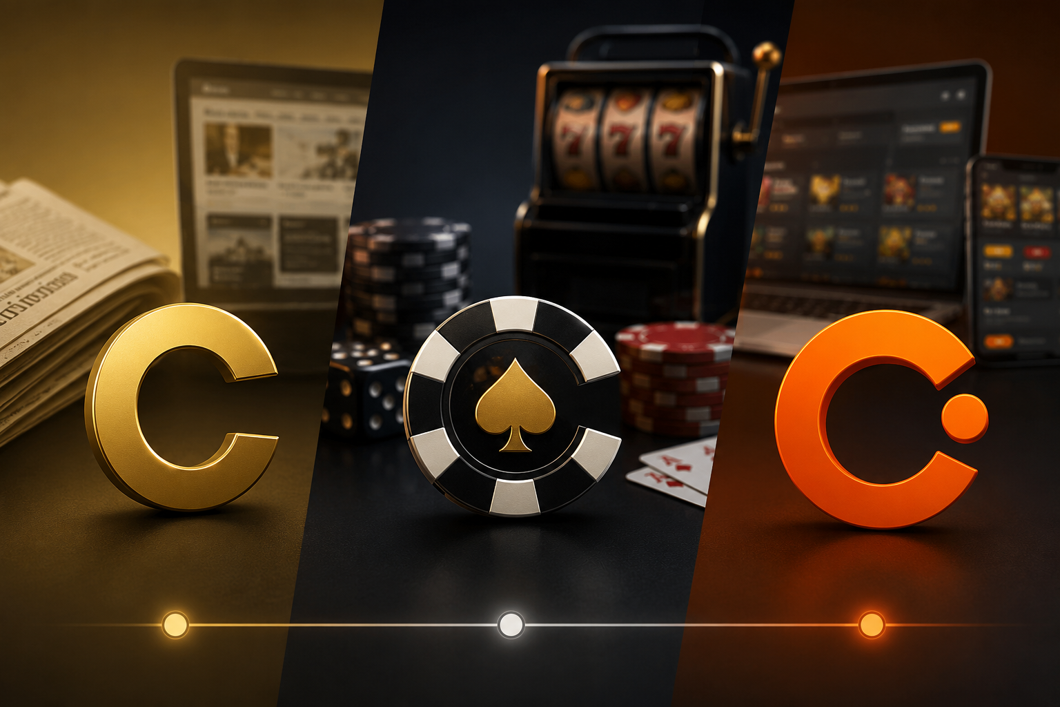
Naturally, the domain name Casino.com gave the site plenty of credibility. But the site’s simple logo design helped as well. At the time of the sale in 2003, the platform’s logo was simply “Casino.com” in gold lettering, with the phrase “Gives You the Edge” beneath it. That logo conveyed how useful Casino.com would be to anybody interested in learning more about the casino industry or keeping up with the latest industry news.
Full-Fledged Casino
Mansion Group, a Gibraltar-based gambling operator, is the company that paid $5.5 million for Casino.com in 2003. They purchased it with the plan of changing the site from a news and information platform to a full-fledged casino. Microgaming, a well-established casino software provider, set up the table games and online slots for the site, which was primarily serving the UK and European markets.
The pivot to an actual casino rather than a news site required a change in logo. During the platform’s heyday as an operational casino, the Casino.com logo featured white lettering, with the “C” in casino being a casino chip with a gold spade in the middle. The tagline for the site was also changed to “The Only Place to Play.” This logo made it clear that Casino.com was a place to play games, fully embracing its domain name and leaning into a gambling motif.
That logo would remain in place through many successful years as a gambling platform. Of course, Casino.com had to continue to evolve through the years, as the technology and capabilities of online gaming platforms improved. By 2016, the site was able to offer mobile gaming and live-dealer games. At the same time, the platform’s game library continued to expand, including over 2,000 slot games by 2017. During this time, the logo remained perfect for a consumer gaming platform attempting to attract and retain customers.
Pivot to Review Platform
After 16 successful years as a real-money casino site, casino.com pivoted again in 2023, becoming an affiliate and review platform. Rather than competing in an increasingly competitive marketplace, casino.com used its credibility and authority to become a trusted review site for online casinos. The site’s architecture was rebuilt from scratch, relaunching in 2024 and ultimately becoming a platform for casino news, reviews, and comparisons.
Of course, this pivot also included a logo change. Rather than a logo that looked like a gaming site, the current Casino.com logo changed to white and orange lettering with no tagline but a capital C in front of Casino.com. The logo is less playful but cleaner and more modern, reflecting the change from a gaming site to one that consumers can trust to provide them with accurate information.
Lessons About Logo Evolution
Casino.com’s logo evolution is a great example for other platforms to follow. The domain name hasn’t changed in more than two decades, yet the purpose and mission of Casino.com has changed on multiple occasions. With those changes, the logo also changed to reflect the direction of the site. The colors and design of the logo changed along with the identity of the site. With any meaningful change or pivot a company undergoes, Casino.com shows us that a new logo is essential to showcasing that change and the new direction of the platform.