


What Is the Android Logo?
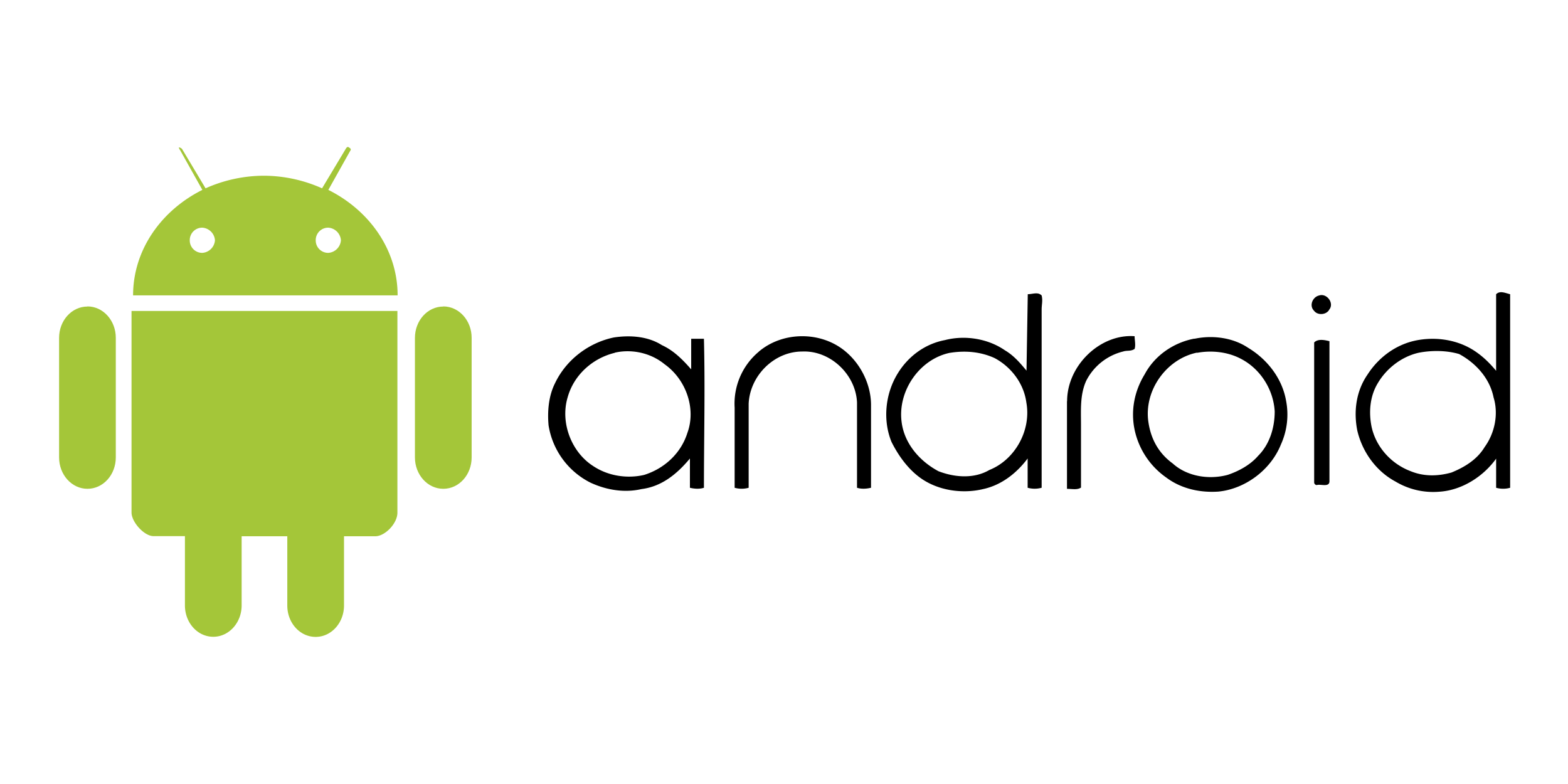
The Android logo is a green robot with a rounded head, two antennae and a simple stubby body, known as the bugdroid. Google designer Irina Blok drew it in 2007, the year Android was unveiled. Android is Google's mobile operating system; it began at Android Inc., a start-up founded in Palo Alto, California, in October 2003, which Google bought in July 2005.
Since 2019 Google has also paired the robot's head with an Android wordmark. The full-body robot is available as the Android logo SVG.
Android Logo Facts
| Designer | Irina Blok |
| Introduced | 2007 |
| Symbol | A green robot, known as the bugdroid |
| Logo type | Mascot: a robot character |
| Owner | Google LLC |
What the Android Logo Means
The name Android points to a humanlike robot, and the logo takes it literally. Blok has said the goal was to create something that everybody could relate to, and that developers in particular took to it. The result is a figure made of plain geometric parts that anyone can redraw.
The robot was released as one of the first open-source logos, and designers and artists went on to make countless versions of it. That openness mirrored the platform itself, which the Open Handset Alliance pitched as open from day one.
Android Logo History
Android was unveiled on 5 November 2007 together with the Open Handset Alliance, a group of tech firms, phone makers and carriers that aimed to build "the first truly open and comprehensive platform for mobile devices". The first Android phone, the HTC Dream, also sold as the T-Mobile G1, was announced on 23 September 2008.
In 2014 Google made the Android logo rounder and friendlier. A bigger change followed on 22 August 2019, alongside the decision to drop dessert names such as KitKat and Lollipop and call the next release Android 10. The android wordmark turned from green to black, because, as global brand director Aude Gandon explained, green was difficult to read for people with poor eyesight. The letters were made thinner and given curved corners borrowed from the robot, and the robot's head was set beside or above the wordmark. Its antennae moved slightly, its eyes were lowered "to bring more humanity", and its green became less yellow and more blue.
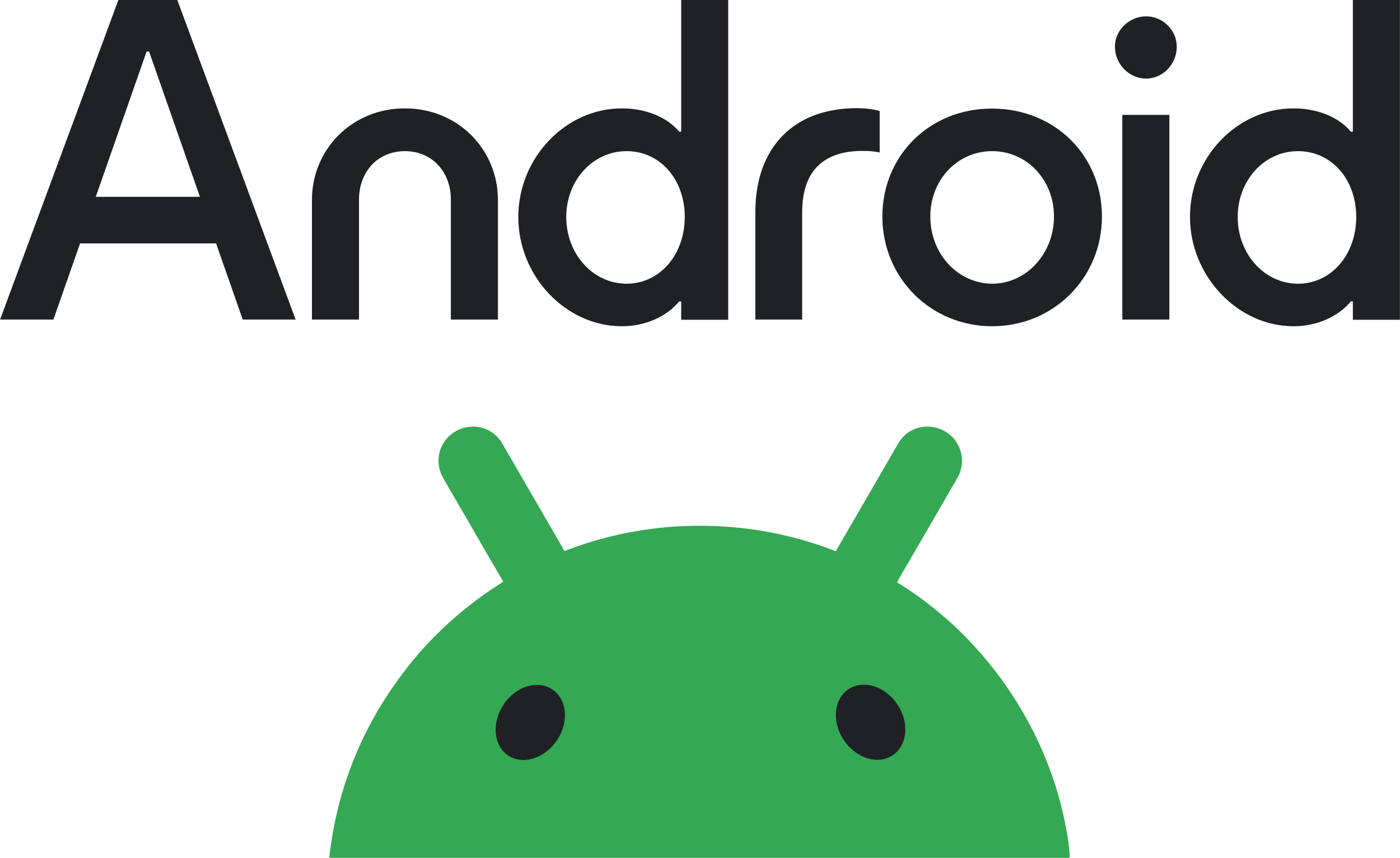
On 5 September 2023 Google refreshed the brand again. The wordmark gained a capital A and took cues from Google's Material design system. The bugdroid got its full body back, this time drawn in 3D. Jason Fournier, director of Android consumer brand management, said the brand should reflect Android's core ethos of being "open, iterative and inclusive".
For more brands like Android, browse our tech logos.
Frequently Asked Questions
What is the Android robot called?
The green robot is widely known as the bugdroid.
Who designed the Android logo?
Irina Blok, a designer at Google, drew the robot in 2007.
Why did the Android wordmark change from green to black?
In 2019 Google said green was hard to read for people with visual impairments, so the wordmark switched to black.
When did Android start using a capital A?
In September 2023, when Google refreshed the Android brand and gave the bugdroid a 3D full body.